Definition
Z-score/standard score – the number of standard deviations that your results are above or below the population mean.
What does this actually mean???
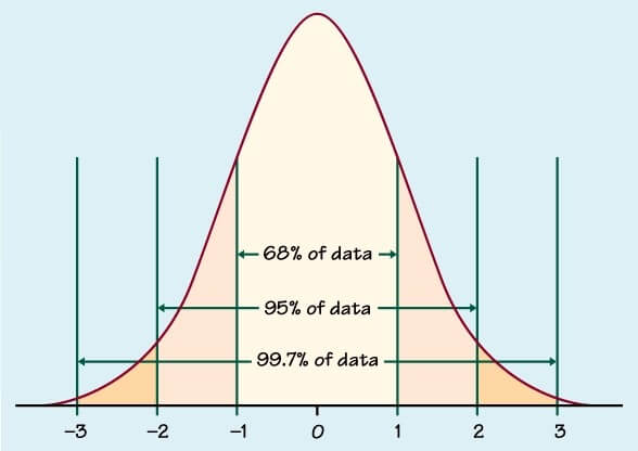
By calculating Z-scores for your data, you can compare your figures to a normal distribution curve (you know, the bell shaped diagram you learnt in school above). Doing this points out any relationships where the results are so off, you can say with 95% confidence that these results are due to blind chance. And you can then look into perhaps why that is further.
It’s actually really easy to do this in Tableau, you just need to create 3 calculated fields. Say you want to see if there is a relationship between Profit and US State in your imaginary store. You’ll need to find the:
- ‘Average Profit’ per state
WINDOW_AVG(SUM([Profit]))
- ‘Standard Deviation of Profit’ per state
WINDOW_STDEVP(SUM([Profit]))
- ‘Z-score’ of Profit per state
(SUM([Profit]) – [Average Profit]) / [Standard Deviation of Profit]
Voila, done. Time to create a viz.
BUILD A VIZ
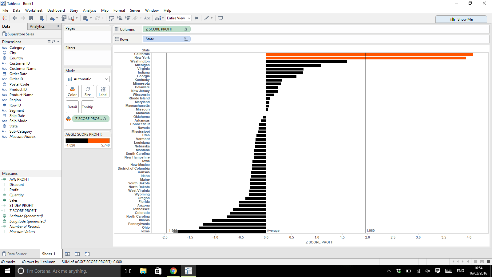
To create a very simple bar chart that highlights which states are significantly more likely to give you a higher profit (if any) then simply drag:
- Z-score calculation to columns – your Z-scores should be quite small e.g. between -5 and 5 as a general guide
- State to rows (make sure your Standard Deviation and Z-score calculations are computed using Table(down) if State is on rows!)
- Z-score calculation to colour
- Edit colours for your bar chart to set to only 2 stepped colours and then set the centre to 1.96 or -1.96 (depending which way your data leans)
- Feel free to also add two Constant Lines to the Table at values -1.96 and 1.96 as well

Why 1.96?
95% of the area under a normal distribution curve lies within 1.96 standard deviations of the mean.
So anything with a Z score below -1.96 or above 1.96 is an outlier and is 95% likely to not be due to chance.

Here’s a great Tableau article on the subject:
http://kb.tableau.com/articles/knowledgebase/z-scores
Cheers for reading!
Anuka
