


After today's session of Statistics 101 we were tasked to write a blog about one of the topics we spoked about, in my case: Z-Score.
- What's a Z-Score?
A Z-Score describes the position of a raw score in terms of its distance from the mean when measured in standard deviation units. It is also known as a standard score, because it allows comparison of scores on different kinds of variables by standardizing the distribution. What does it actually mean?
We were given an example of two students: Fred and Paul, Paul scored 65 marks from English and Fred 81 marks from History. Which one performed better? We were told as well that:

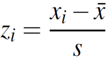
To calculate Z-Score we need to subtract from the score the mean and then divide it by the standard deviation. The equation looks as following:
Let's calculate Z-Score for Paul and Fred.
Paul: Z-Score = (65-60)/4 = 1.25
Fred: Z-Score = (81-79)/2 = 1
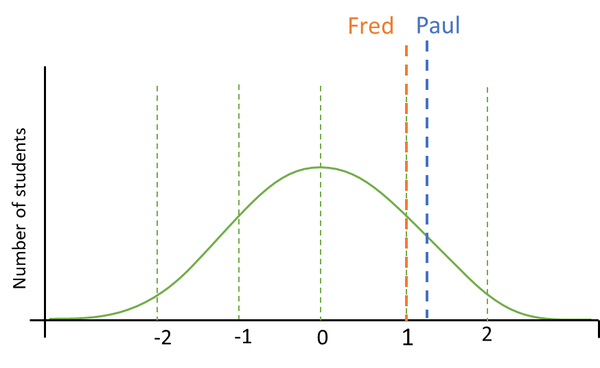
Even though Fred scored higher than Paul, Paul performed better than Fred compared to the rest of their classmates.
2. How to create a Z-Score in Tableau?
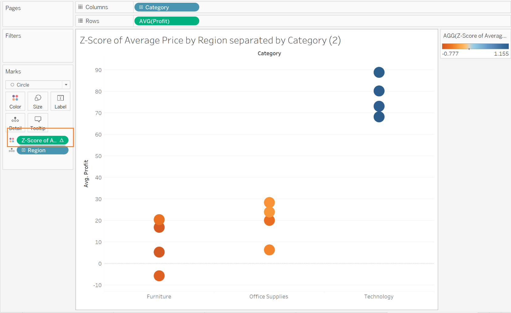
For this exercise I will use a Sample SuperStore dataset. We will recreate a chart that represents Z-Score of Average Price by Region, separated by Category.
a) To begin, we need to drag Category onto Columns Shelf, then Profit aggregated to Average onto Rows Shelf and Region onto Details in Marks Card.
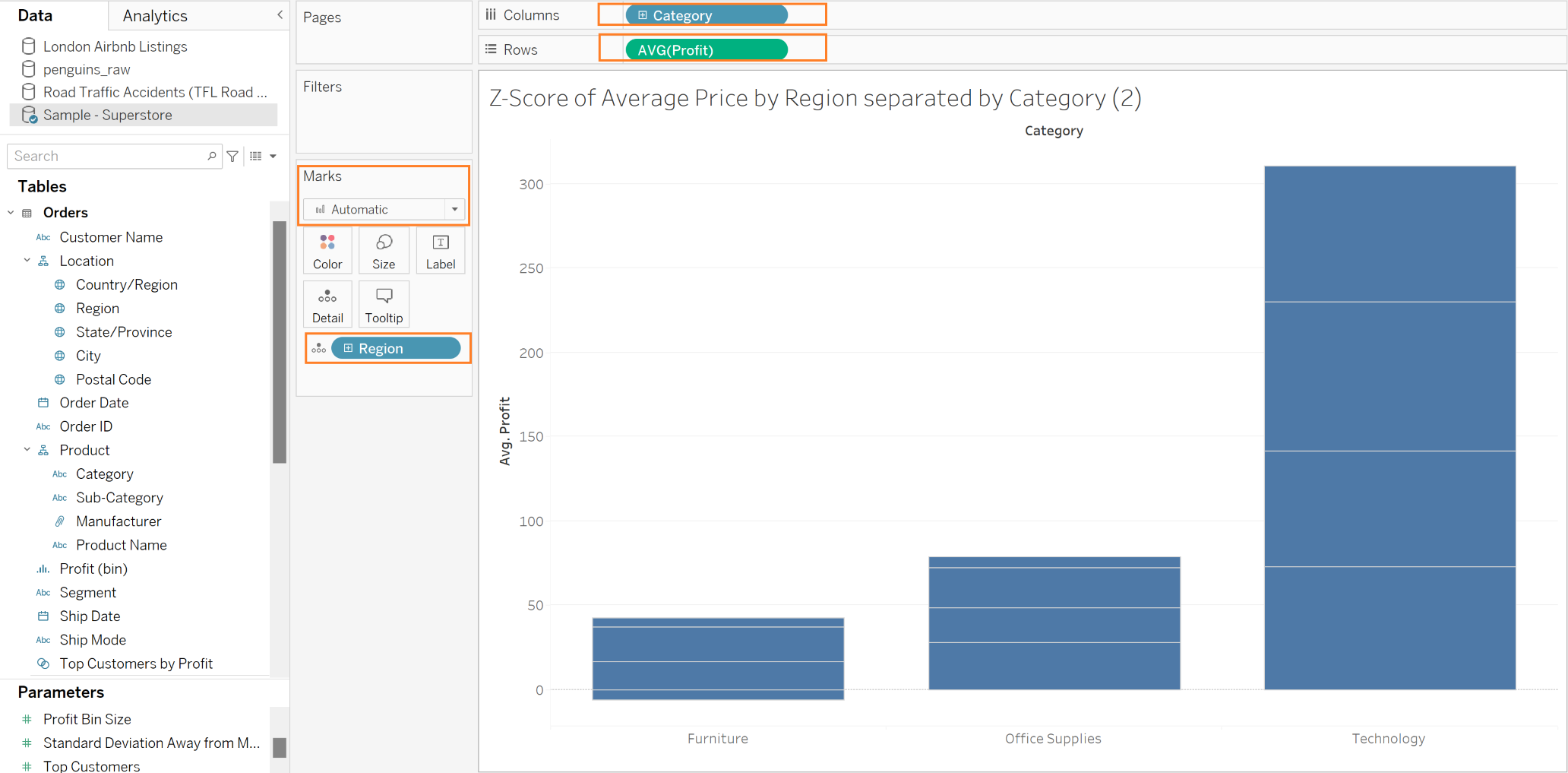
b) The next step is to change the Automatic on Marks Card - highlighted above, to the Circle. Then, we need to create a Calculated Field, so Tableau can create the Z-Score for us. In this instance, the calculation will be:
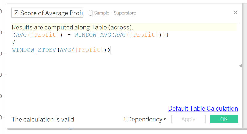
We need to subtract from the Average Profit, the Window Average of Average Profit divided by Window Standard Deviation of the Average Profit.
c) The next step is to drag our Calculated Field onto the Color in Marks Card. At this point you might notice that something doesn't look right. Why?
We can notice that our Calculation has "△" next to it, it means that it is a Table Calculation and for it to work well, we need to Edit it.
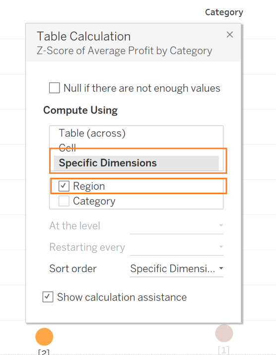
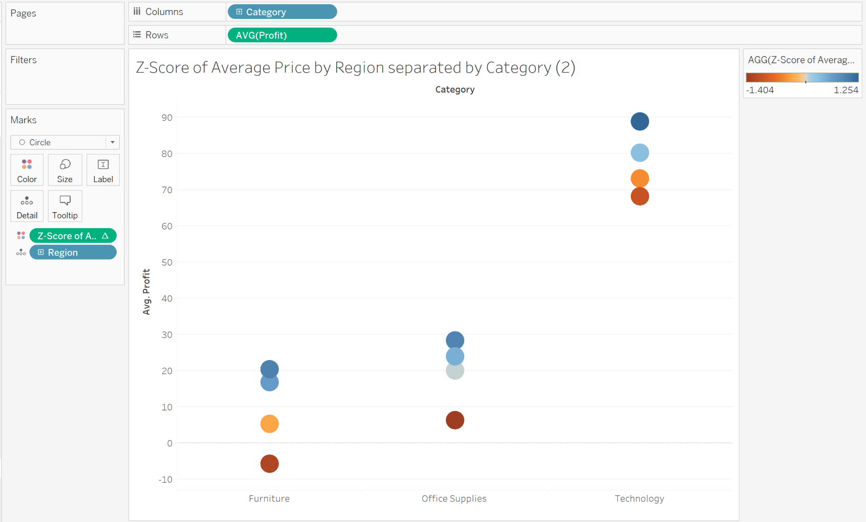
We want for the calculation to compute for each Category by every Region. At this point we should get a ready chart that looks this way:
I find it useful to drag the Z-Score Calculation (by holding the Ctrl) from the Marks Card onto the Rows Shelf to better visualise the distribution of the Z-Score among different Regions. #
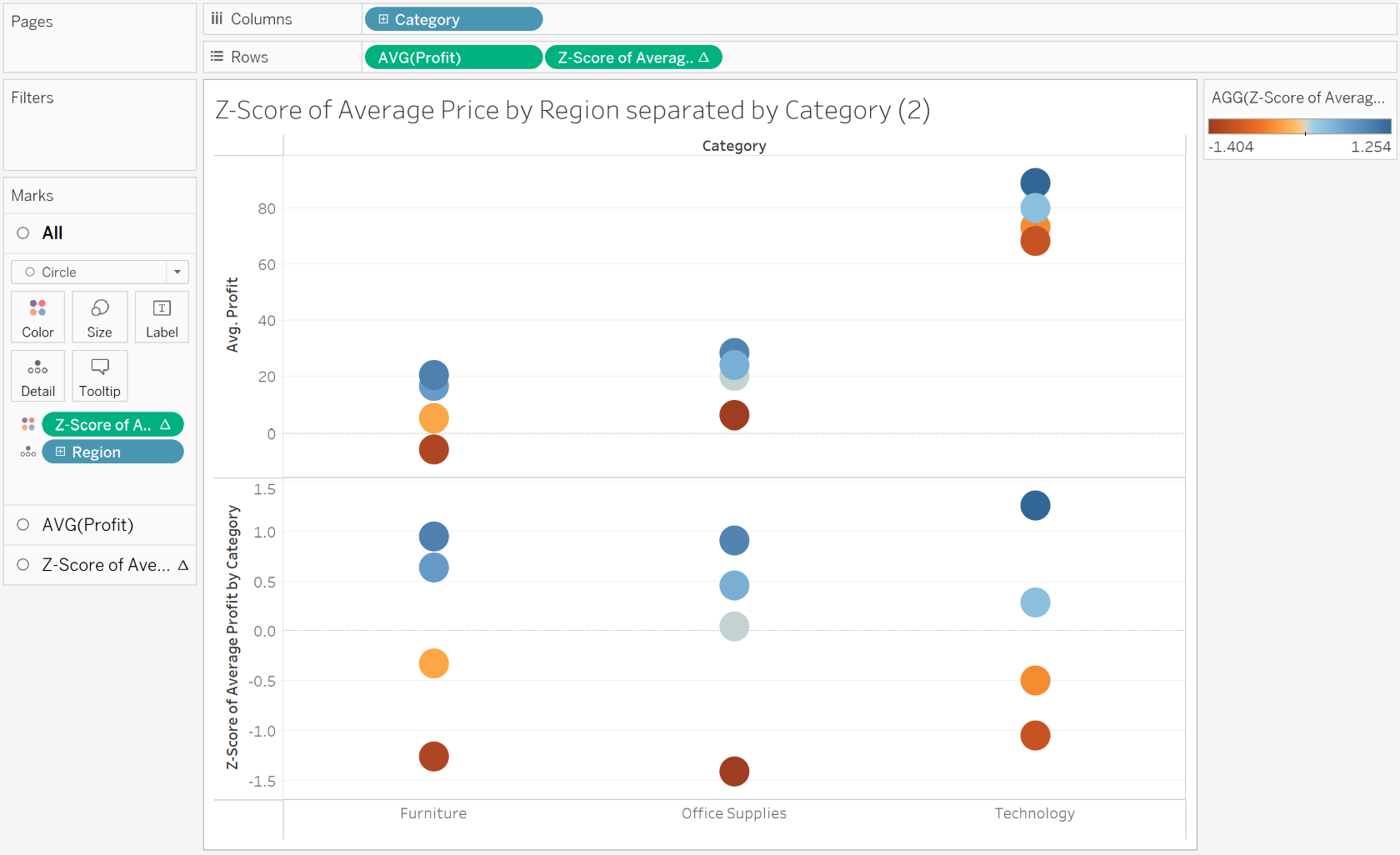
There is no single conclusion by looking at the chart above, however it helps us to understand how different Regions perfomed compared to others in different Categories.