Today we had our first dashboard week and it was really interesting. Our dashboard was focused on being accessible to a specific target chosen by us. I chose to do a dashboard aimed at those with partial and full visual impairments.
The data
The data was looking at the rise in sea level in two scenarios; what happens if we don't make any changes regarding carbon emissions, and what happens if we make relatively drastic changes. I found the data very interesting and enjoyed reading around the subject.
My thought process
There was the option to add other data sets to this project but I chose to stick to the two we were given as that would let me focus on the accessibility aspect. After doing some research, I decided that highlighting the rise in sea levels and what that meant was the way forward.
Dashboard design
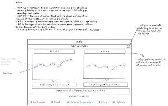
In keeping with this idea of simple dashboard (the focus being on accessibility) I designed a dashboard that would have two line charts, one for each scenario. The line chat will show the projections to 2100 and map the years natural disasters occurred to see if that had an impact on sea levels. My dashboard design also included a lot of text, more than i normally would include. If the dashboard is aimed at those that are visually impaired, especially those using a screen reader, then having text to read seemed more important than trying to make the dashboard aesthetically pleasing.
My Actual Dashboard
My actual dashboard turned out very similar to my design. The only difference was I created a natural disaster timeline instead of putting it on the line graph because you can only make a dual axis in Tableau and I would have needed about 4 combined axes minimum.
I made the text too small though so that's something that needs changing. I also need to look into the contrast. My timeline has more contrast and draws attention but that's not the important part of the dashboard. The light grey text needs to be darker and contrast more with the green I used. Perhaps a different colour like neon pink may have been better. 😉
All in all, I was really happy with this project. Here's the link, take a look.