


The purpose of visualization is insight, not picture. Ben Schneiderman
Today our task was to produce a dashboard with universal design -ensuring that a wide number of people can use, understand, and have access to it. Below is the outcome of this day's challenge:
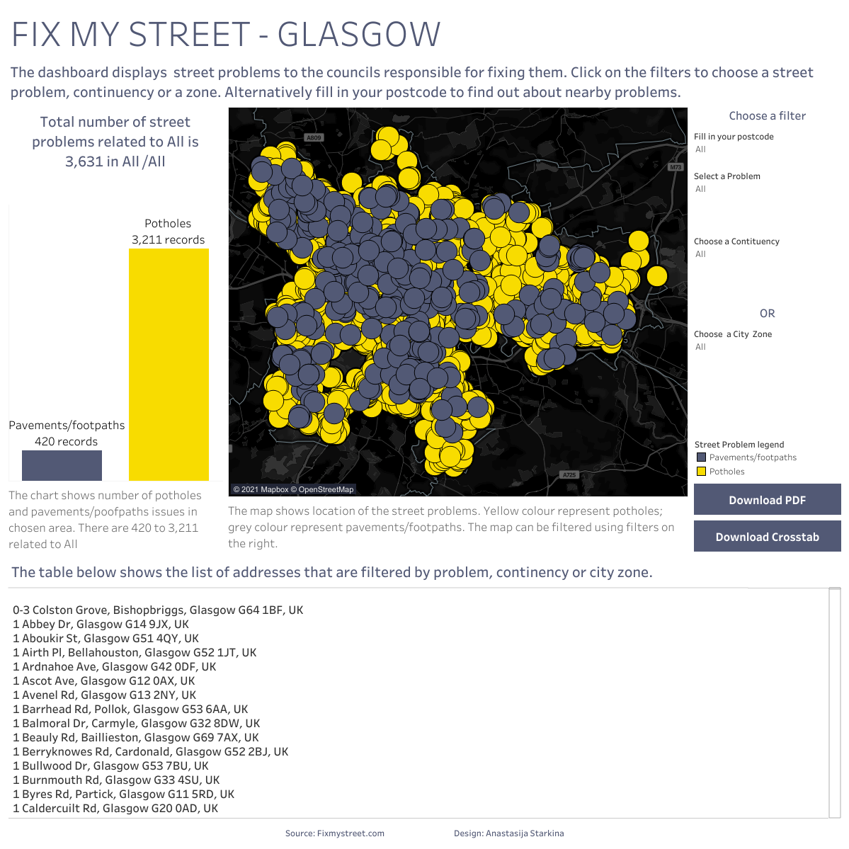
Link: Dashboard week day 2: FIX MY STREET | Tableau Public
In this blog post I will explain:
- How to make your dashboard more accessible?
- Why it is important?
- Accessibility dashboard design- bad practices
- Share useful links that could help you along the way
Tips to make dashboard more accessible?
Data visualization itself is a form of accessibility technology. It tries to spread the information to the wide number of people and as such, requires to take into consideration a wide range of factors. Below is the list of features you can add to your dashboard to make it more universal:
- Use color-blind accessible palette
- Labeling line directly ( in high- contrast color)
- Making text and mark size larger
- Avoiding visual overloading with marks, colors, or categories.
- Using captions to describe the chart. Makes it available for screen readers.
- Showing most recent value (keyboard controllers cannot access tooltips).
- Outlining how to interact with chart and see underlying values.
- Using no more than 10 colors or shapes.
- Including clear, explicit instructions for how to use the dashboard (don’t just rely on symbols).
- Using newer versions of Tableau make it easy to include a button to download the data as a crosstab which can be opened in Excel.
- Using Alt text on images and button.
- Using titles whenever possible; These are read aloud by screen readers along with specific text describing how to operate with keyboard.
- Giving titles to legends.
- Using contrast 4.5:1 for normal text and 3:1 for large text.
Why it is important?
Economics:
● 18% of working age population of Britain have a disability (as defined by Equality Act of 2010)
● Competitive advantage if we're the best when it comes to universal design.
● Many companies have policies around accessibility.
Goodwill:
● Being a strong and vocal advocate or universal design can get your work noticed and encourage other companies to follow suit.
● Users of products that are particularly good/accessible are often vocal advocates with their community.
Legal:
● Some clients have legal requirements to make accommodations for users of assistive devices.
Moral:
● Living with a disability makes life harder in many ways, we should avoid making even tougher where we can.
Adapted from Kyle Waterworth, Alteryx Accessibility project manager
Bad visualization practices:
● Mark selection and actions are not supported for keyboard navigation.
● Tooltips are also not supported for keyboard navigation- Alternative is to direct users to “View underlying data” where the tooltip information will appear ctrl+shift+enteraccesses “View underlying data” table on web.
● Views with over 1000 marks are not WCAG conformant because they are rendered by the server and not the browser.
● Views that use the polygon mark type are always rendered by the server.
Useful resources
NVDA- Takes information from the Document Object Model (DOM) and verbalizes it for the user.
Funkifychrome extension-Simulates a variety of impairments (e.g. low vision, tremor, colourblindness) in browser setting.
Color Palette contrast checker-Compass up to 5 different colors for contrast accessibility and suggests replacements
Color Oracle -Color blindness simulator.
Edit XML for Focus Order Walkthrough-Kelly Gupton, Director of Project Management, Tableau
TC19: Designing Accessible Dashboards in Tableau-Kelly Gupton
Chartability–Rubric for scoring “Data Experiences” on accessibility
Follow #a11y on twitter