


In this blog, I want to show how to quickly and easily create a separate color legend for a highlight table in Tableau. I’ll show two scenarios: the first with three measures, and the second with only one measure and different dimensions (for example, sales across different years or categories).
Scenario 1:
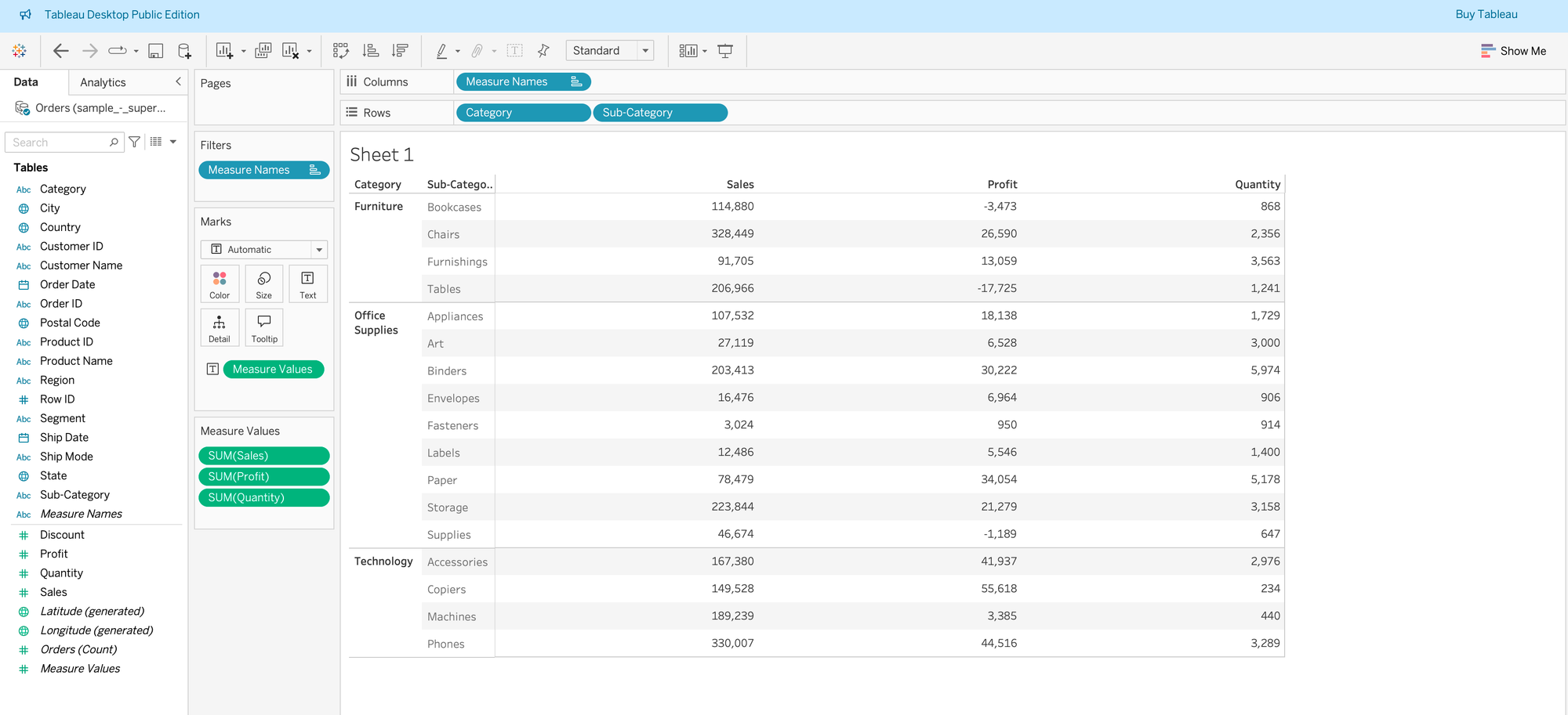
Step 1: Create a table with the measures and dimensions needed for your analysis. In my case, I used Category and Sub-Category with Sales, Profit, and Quantity from the Superstore dataset.
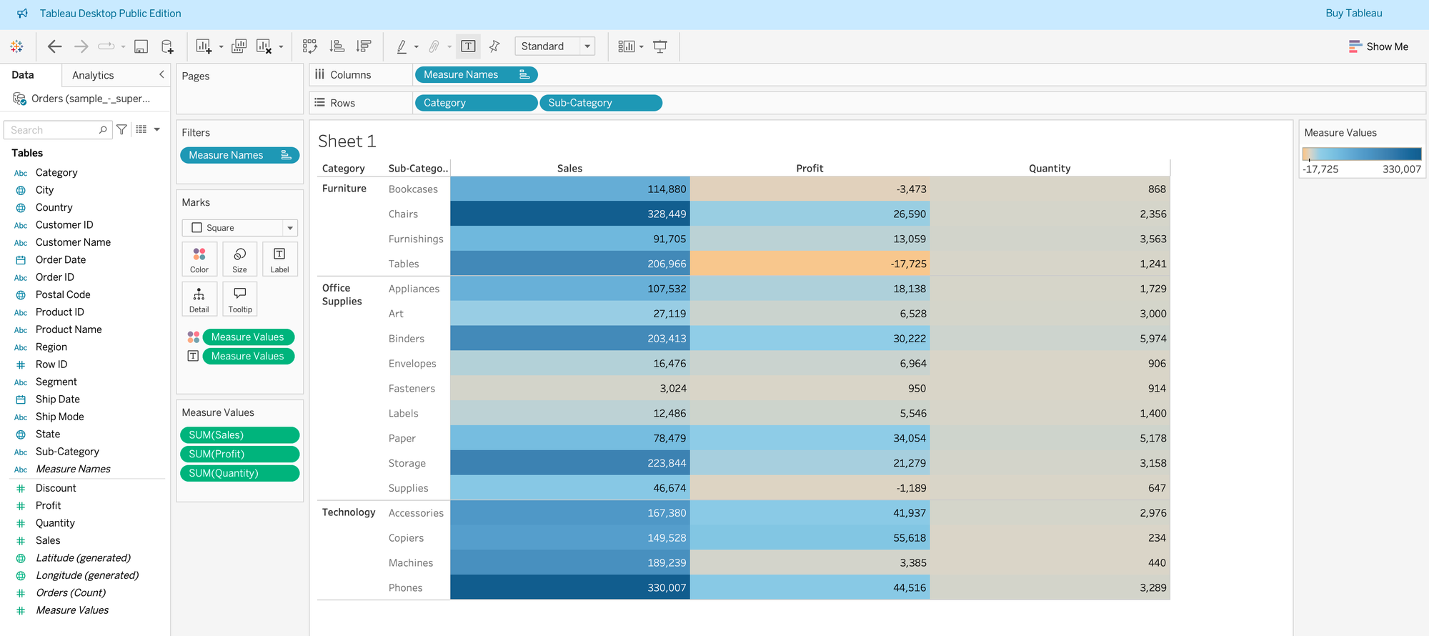
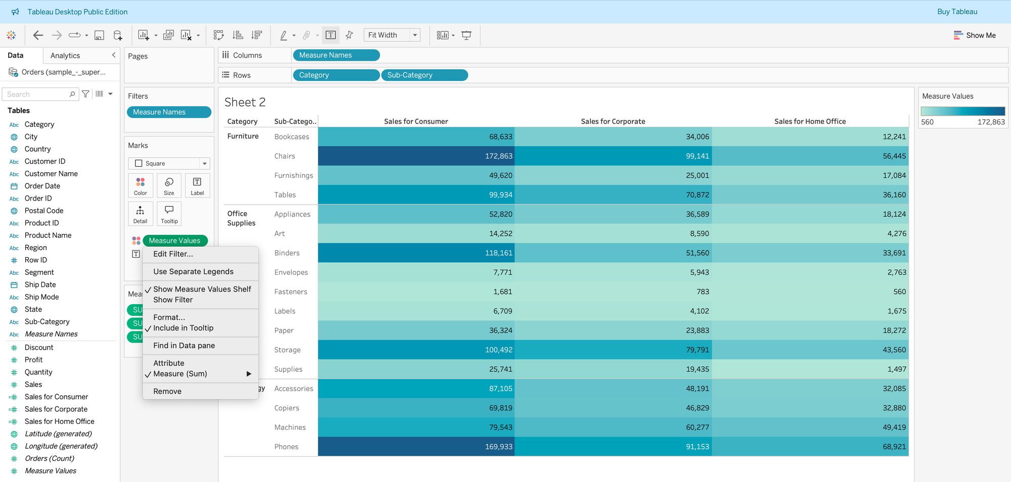
Step 2: Put Measure Values on the Color mark to create a diverging color scale, and select Square as the chart type.
Step 3: Click on the dropdown for Measure Values on color, and you will see the option “Use Separate Legends.”
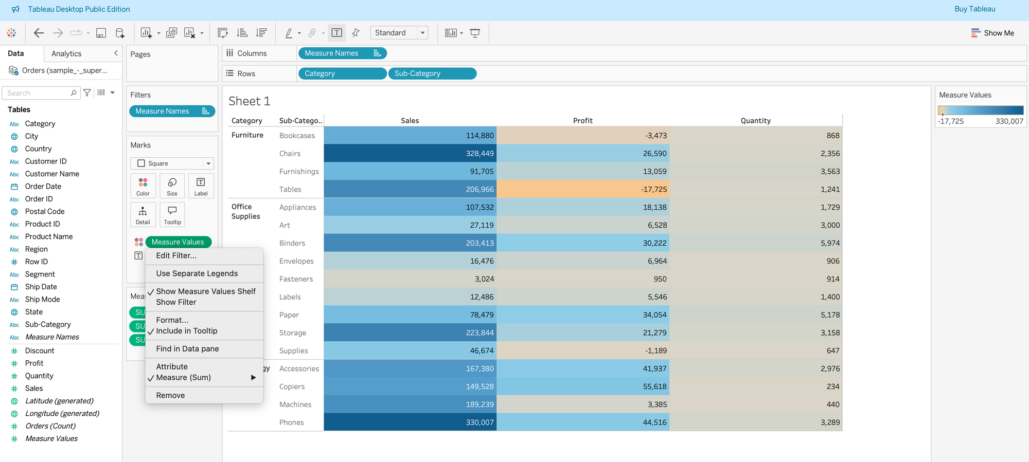
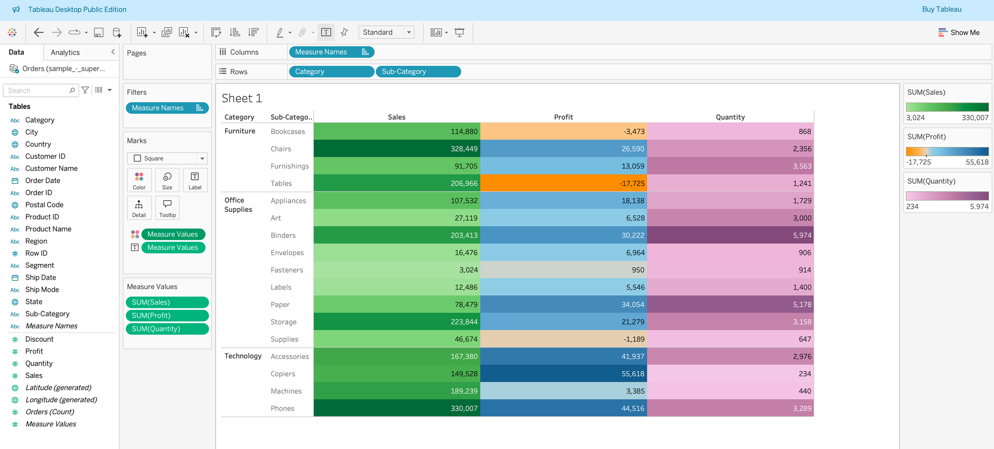
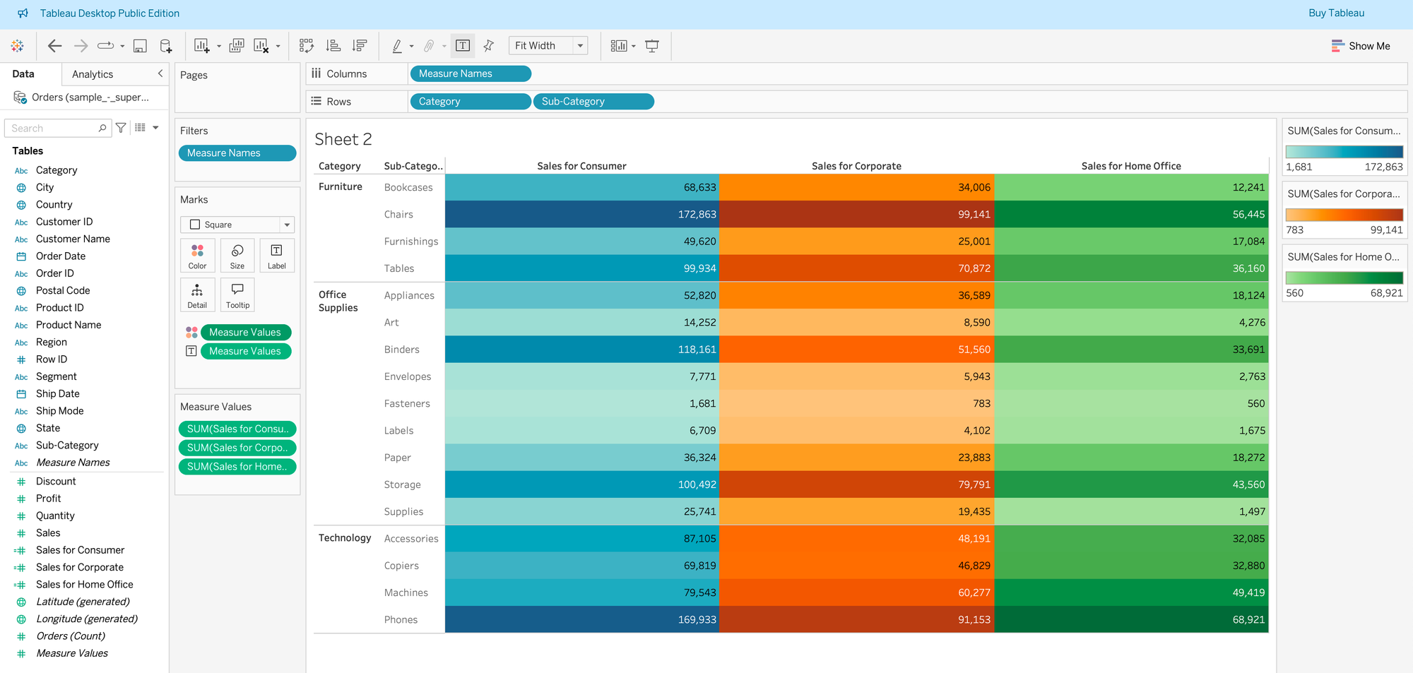
Step 4: After selecting that option, Tableau will create a different color gradient for each of your measures. Choose the colors you prefer, and now your values will be compared only against values within the same measure 🙂
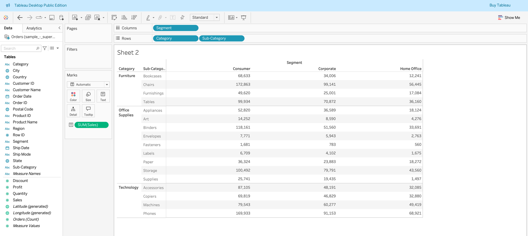
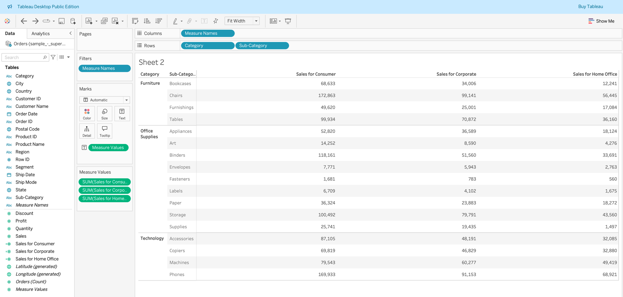
Scenario 2: You only have one measure and want to compare it across different dimensions separately. In my case, I want to compare Sales across three segments, so I can see the range of values separately for Consumer, Corporate, and Home Office.
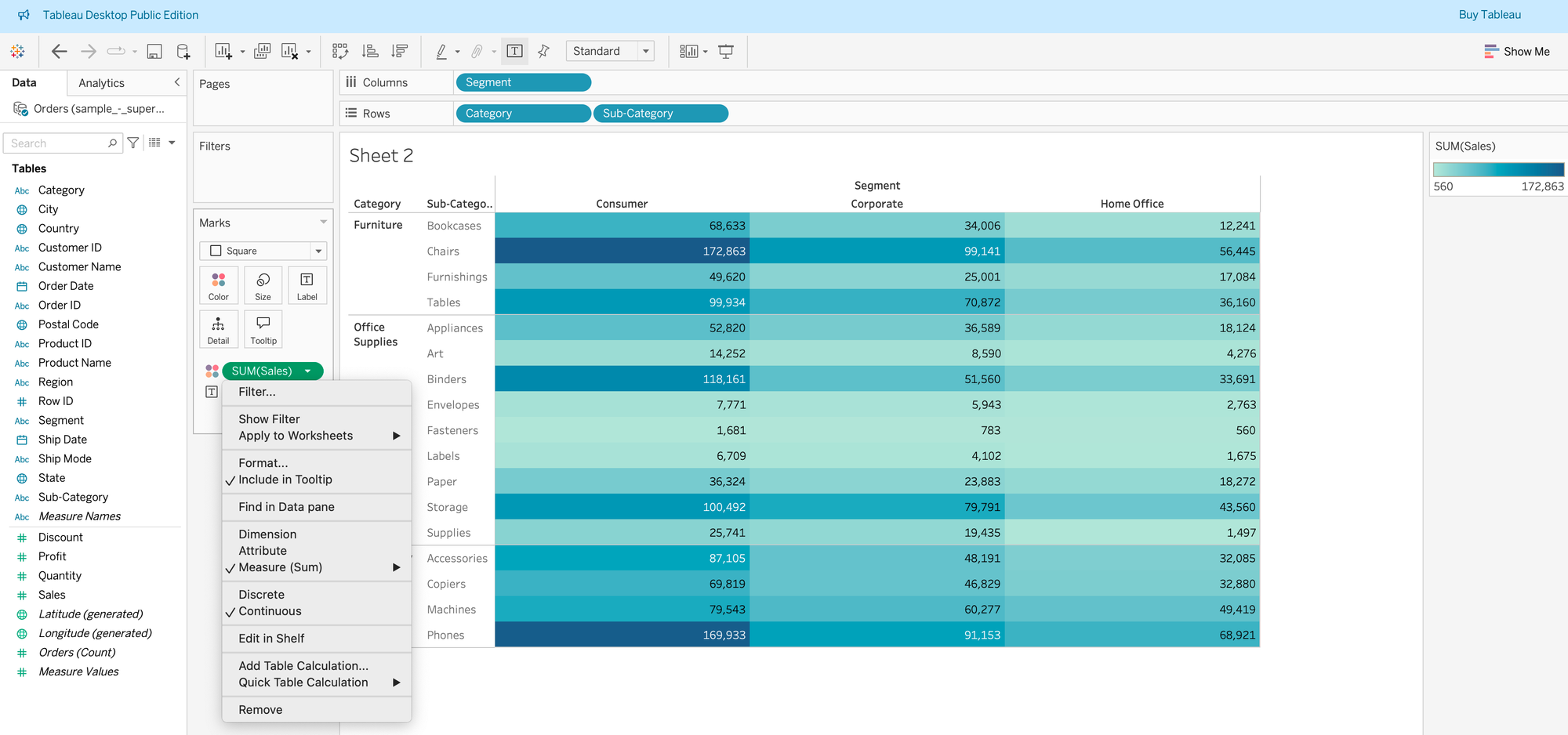
Step 1: Prepare your table with the needed information. For my example, I used Category, Sub-Category, Segment, and Sales. If we follow the same steps as before (putting Measure Values on Color and selecting Square as chart type), we won’t see the option “Use Separate Legends” anymore (see second screenshot), since in this case we are only showing Sales.
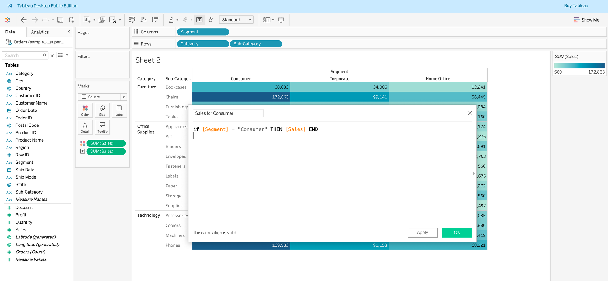
To fix this, we need to create separate Sales fields for each segment using a simple calculated field.
Step 2: Create a calculated field for Sales for each segment. After creating the first one, just duplicate it two times and adjust the formula and naming for the other two segments.
Step 3: Go back to your table with Category, Sub-Category, Segment, and Sales. Remove Sales and Segment to avoid duplication of information, since we now have three calculated fields (which already show both segment name and sales).
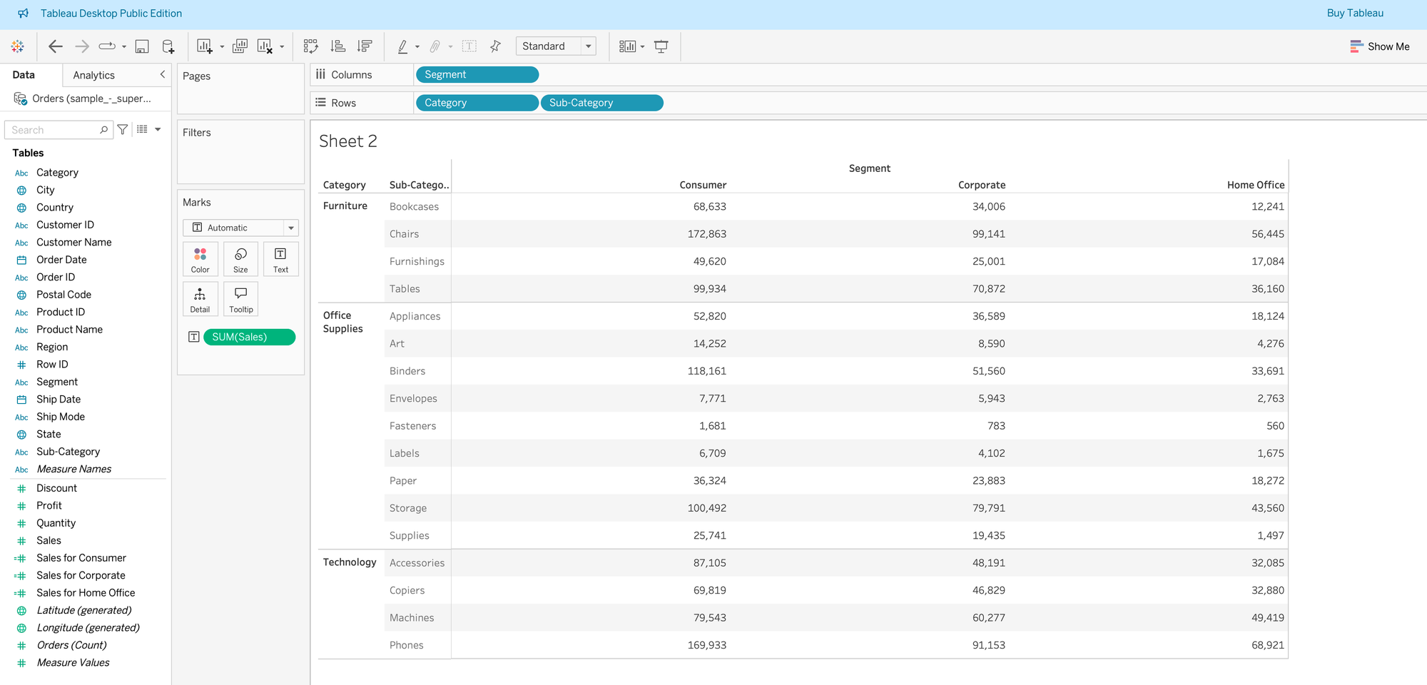
Then double-click on the fields Sales for Consumer, Sales for Corporate, and Sales for Home Office to add them to the table. You should now see something like this:
Step 4: Repeat the steps from Scenario 1. Put Measure Values on Color and select Square as the chart type. Now you will have the option to create separate color legends for each of your segments (or whatever dimensions you use in your case).
Now we can clearly see the minimum and maximum values for each segment separately 🙂
I hope this was helpful to you! 🙂