


Between 17th March and 14th April, Chelsea FC put a challenge out to the public to 'create the most compelling Physical Performance interface for elite football players and their coaches'. So our challenge for Dashboard Week Day 1 was to build a report on one or more of the provided mock data sets from the Chelsea Football Club Vizathon using:
- Power BI Desktop
- Power Query or Alteryx (if data prep was required)
The data sources we were provided with were:
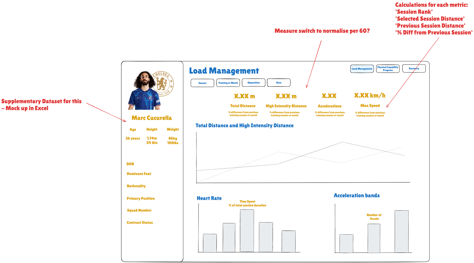
- CFC GPS.csv: GPS performance metrics track movement demands, including speed, distance, and acceleration, to assess workload and physical output. This dataset contains simulated data for 1 player
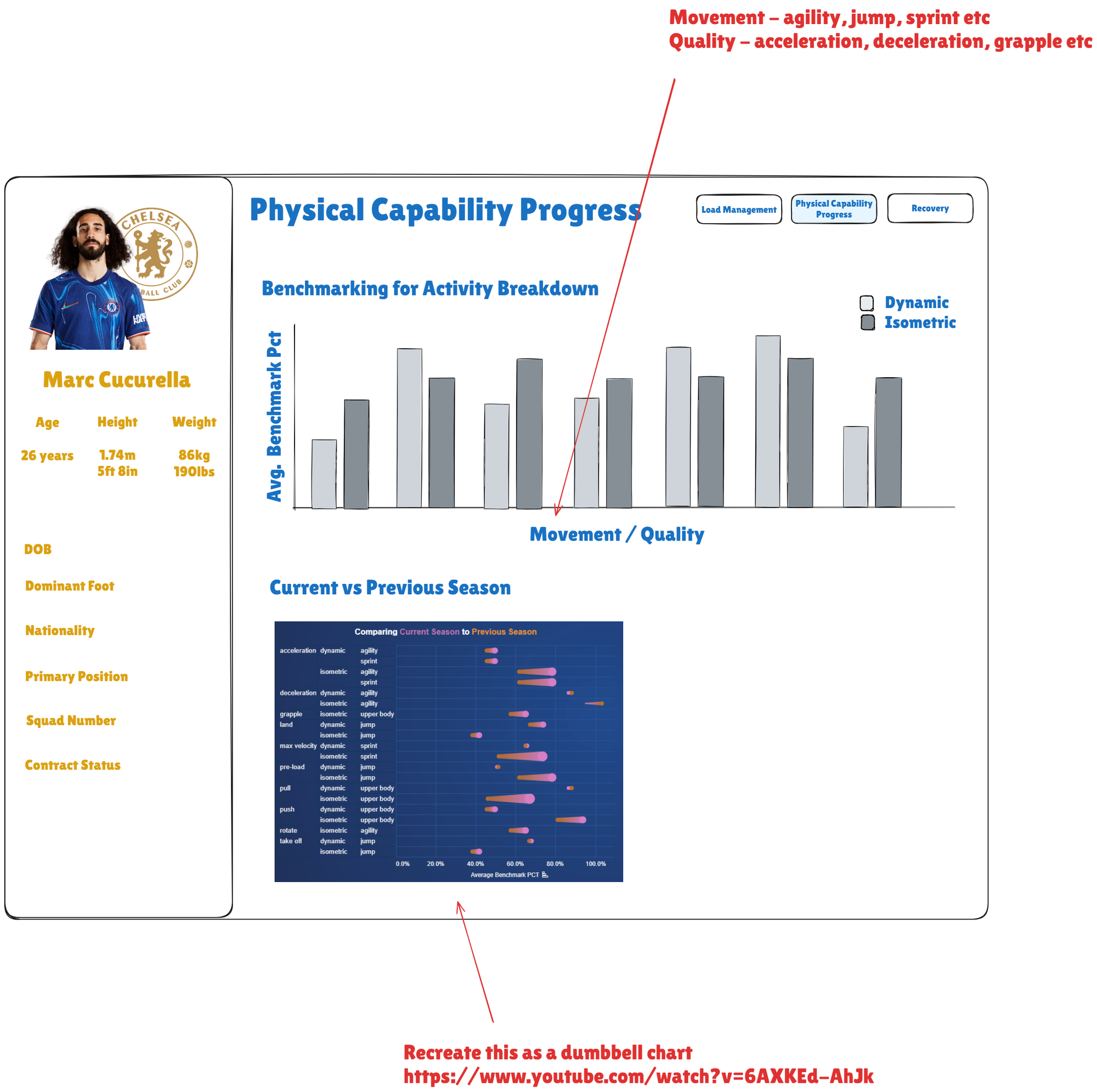
- CFC Physical Capability Data_.csv: Physical Capability is measured using a battery of tests which measure different qualities and expressions of force.
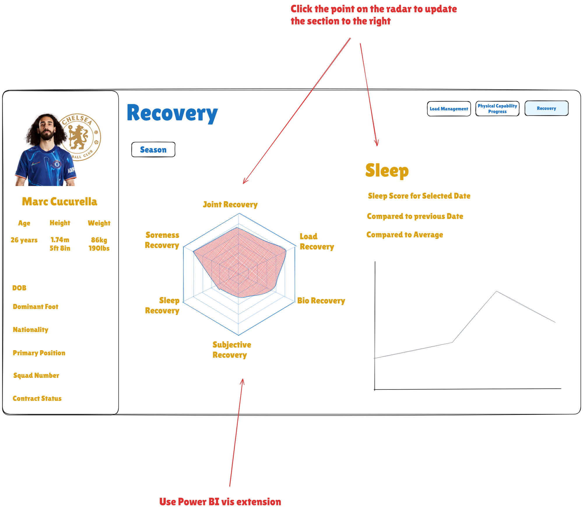
- CFC Recovery Status Data.csv: Recovery status is measured using several tests and metrics to inform recovery strategies throughout the season. This dataset contains simulated data for 1 player.
- CFC Individual Priority Data.csv: Individual priority areas are identified and reviewed by the player and Performance Support Team.
I started by reviewing the data to determine if any preparation was necessary. Since the required cleaning could be handled in Power Query rather than Alteryx, I was able to move on to sketching fairly quickly. From there, I identified three main focus areas to explore:
- Load Management
- Physical capability progress
- Recovery
I then went straight into PowerBI and started to create a data model connecting each of the datasets on their date field. In order to build two of the bar charts I also created two reference tables from the GPS dataset to pivot the HR zone data and acceleration band data so that each could be displayed better on one axis. These were the connected back to the GPS data in the model on the date fields.

With the HR reference table I then created the following column to calculate the duration of time in minutes spent in each zone:

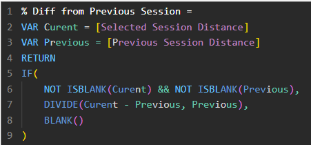
To find the % difference from the previous training session or match I utilised the following custom column calculations for each metric:
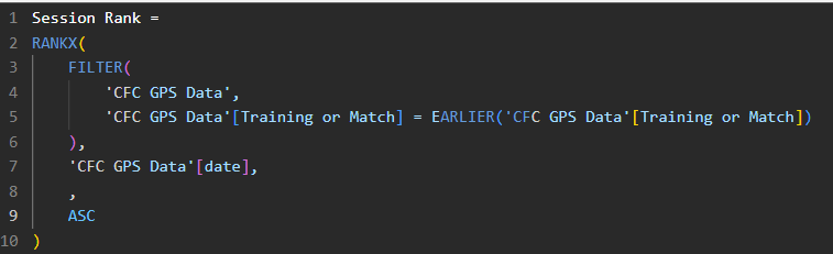
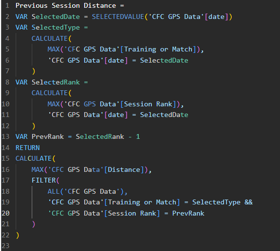
First I had to create a calculated column that ranks sessions within each type (training or match)
Then I used a measure to find to calculate the chosen metric for the selected session
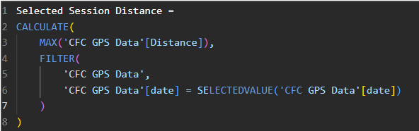
I then utilised the following calculation to find the metric for the currently selected session, and find the previous session of the same type, and return the distance recorded in that session.
Finally, the difference between the selected and previous session was calculated using this calculation
Overall, I was able to complete the first dashboard within the time available. However, I definitely overestimated the scope and was a bit too ambitious, which meant I didn’t manage to finish the next two dashboards. That said, I’m excited to revisit this as a personal project and continue developing my Power BI skills. Hopefully I will be able to update this blog with a completed version of the dashboard soon😄