


When applying to the Data School, it can be tempting to look at data art and aim for those kinds of dashboards with custom solutions, but as a consultant, you're going to want to build dashboards that are easy for your user to use and possibly maintain.
I find it very challenging to build a dashboard layout that looks tidy and efficient if I have a tiled object in my dashboard container, so here is how you can avoid that from the first object you put on your dashboard.
- Size your dashboard. This can be any size, you can resize later.
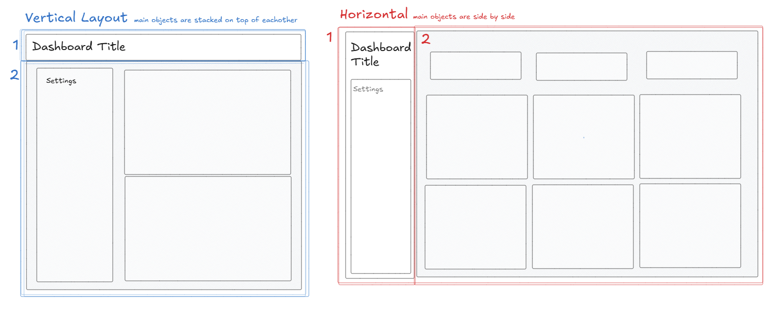
- Decide if your main container will be a horizontal layout or a vertical layout
- Hold shift and bring that container (vertical or horizontal) onto your dashboard. This will bring your container onto your dashboard as a floating object - which we use very intentionally.
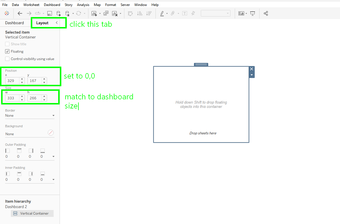
- Next, with your floating container selected, go to the layout tab.
- Set the position to x = 0 and y = 0.
- Set your height and width to the height and width of your dashboard.
- Voila! Now your main container is locked to your dashboard and will resize with it. That main container is no longer floating.
Another sneaky way tiles make their way onto your dashboard is through parameters and filters.
When you bring a sheet onto your dashboard which had parameters and filters shown, these elements will be brought onto your dashboard in a new tiled container.
If you want to keep those items, but nest them into a horizontal or vertical container, you can temporarily float those items, remove the tiled objects from your container, and un-float those filters or parameters.
They will arbitrarily be placed on your dashboard but they will be easy to move!