


What is it?
It is a data visualization tool which allows you to:
- Connect to data
- Model data
- Visualize Data
A visualization is a visual representation of data, for example a chart, map, and so on. The purpose of it is to present data which gives insights which are usually difficult to see from a raw table of numbers.
The difference between Tableau is that you create everything in one place, rather than between separate worksheets. In Power BI they are called "tiles" which represent individual chart.
OVERVIEW:
Power BI can be segmented into different sections
- Ribbon

All the controls are at the top.
- Pages
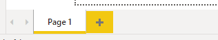
This is equivalent to "New Dashboard" in Tableau
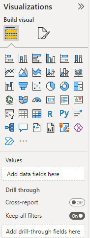
- Visualization Pane
Think of this as the "View" in Tableau, it allows you to quickly build out charts and you'll be working mostly with this in Power BI
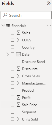
- Fields Pane
It shows you what kind of fields you have and what values they represent. Date has a calendar to indicate it's a date. The other fields such as Sales, COGS, and so on are values which can be summarized.
- Filters Pane
Allows you to check through the data, union it and so on.
CONNECTING TO DATA:
To connect to the data click the "Get Data" button at the ribbon pane. Choose you desired data set and you can already work with it.
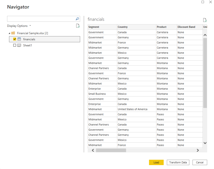
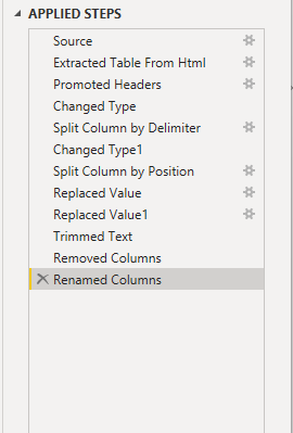
For example by clicking "Transform Data" which allows you manipulate the data however you want, create new columns and such. Think of it as a Tableau Prep (if you worked with it) the "clean step"
BUILDING YOUR FIRST CHART:
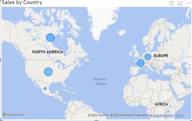
From Fields choose sales and country, and choose the globe from the Visualization and this will build out your first map e.g.
In order to format the colours, you need to click the small icon that looks like a bar chart with a brush:

This allows you to adjust the colours however you want and opens up a field like this:
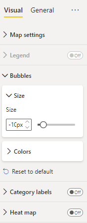
This view will allow you to change the colours and formatting of your map. It is also possible to click on the individual values at FIELDS in order to format them.
Some extra things:
- POWER BI is also capable of doing proportional brushing automatically, which usually needs to be built out in Tableau.
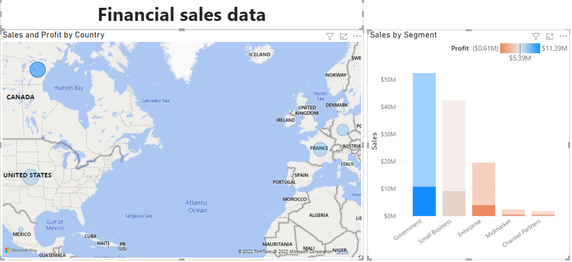
Clicking on a country or the bar chart filters the other views. For example, country does proportional brushing on the charts.
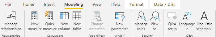
- Creating calculated fields:
Modelling in the ribbon and selecting "New Column"
In the created column one can choose the name and the calculation

For example: NAME = FORMULA. Where the name is the name of the column and the formula would be the formula used to make the calculation.
- It is also possible to webscrape in Power BI
This is done by clicking on the Get Data -> More -> Web
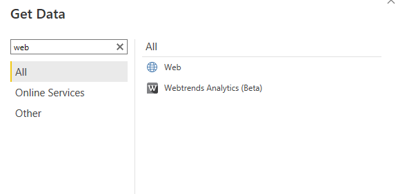
Then all you need to do is enter the URL you want to webscrape for example, I used IMDB Top in order to webscrape it. From there just choose the sheet you want to webscrape and can apply any data cleaning steps that you know or learned from before. Don't be afraid to just play around with the program.
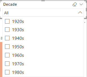
- Adding Filters:
Click anywhere on white space, and then click from the view pane "slicer"
Then just click on whatever field you want to filter by and voila, you made your filter.
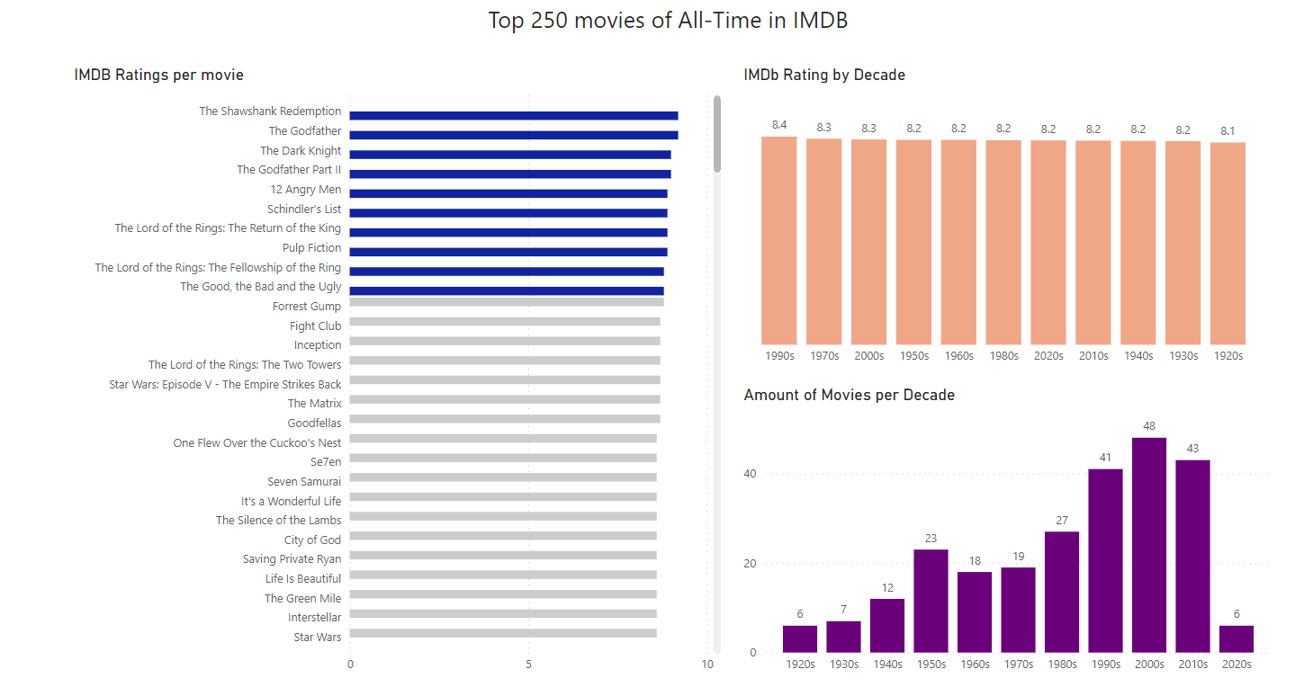
In the end it is possible to create simple things like this:
That's it for the quick introduction to Power BI, thank you for reading :)