


After starting at the Data School, one of the first things I noticed was how much I had to keep track of!
There are plenty of great organisation tools out there, but as I am already on a Tableau learning journey, I thought I would attempt to build a planning tool in Tableau.
I personally love using Gantt charts for planning, often building them manually in Excel. I therefore decided to make a Gantt chart the centerpiece of the dashboard. This would show all the tasks due to be completed and how long I have to complete them.
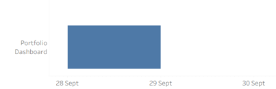
I want the chart to be similar to this one I built in Excel.

The Data:
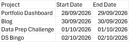
In order to start building the Gantt, I had to make a data source of my plan in the form of an Excel spreadsheet. Here I’ve created one week’s worth of tasks. There is a column for projects and a start and end date for each project.
Building the Gantt:
For this chart, we want a continuous left-to-right axis to give us a timeline for each project. So we drag our start date to our columns, setting it as continuous.
Then we can drag the project field onto rows.
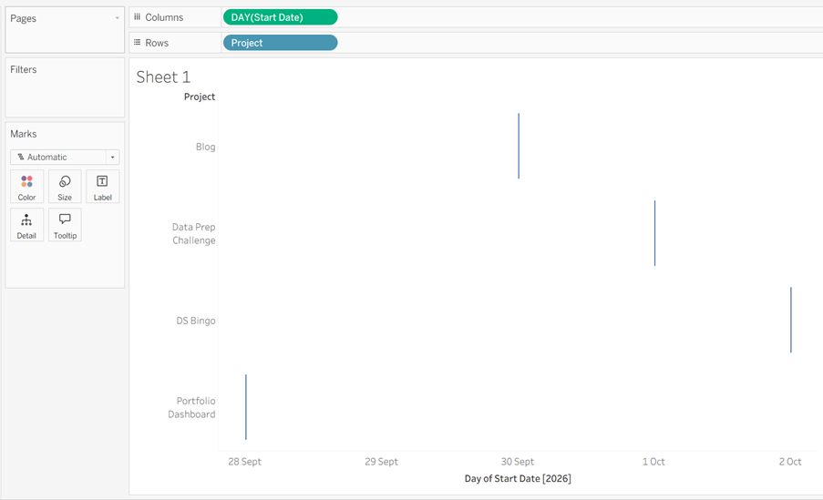
The chart type has automatically been set to Gantt, and Tableau has placed a mark at the start date of each project.
In order to create the length of each bar, we need to set the size by the duration of each task.
There are a couple of ways this could be done. For example, you could create a duration field in your original spreadsheet. Or you could even just give a duration instead of an end date in your source spreadsheet if you find it easier than visualising the end date of your task.
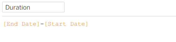
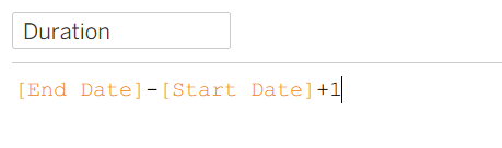
In this case, I am going to create a calculated field to figure out the duration of the task.
Placing the duration on the Size Marks Card will extend the Gantt marks, visualising the length of time we have for each project.
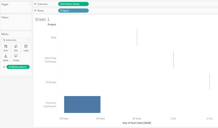
However, this is where we have come across our first problem. When making a planner for one person, a lot of smaller tasks which would only take a few hours or (even minutes) within one day will need to be included. Because of our formula, tasks with the same start and end date have been calculated as 0 and therefore have no size added.
We can also see that our time blocks are cutting off on the end date instead of filling that day.
The solution is a simple alteration to our calculated field.
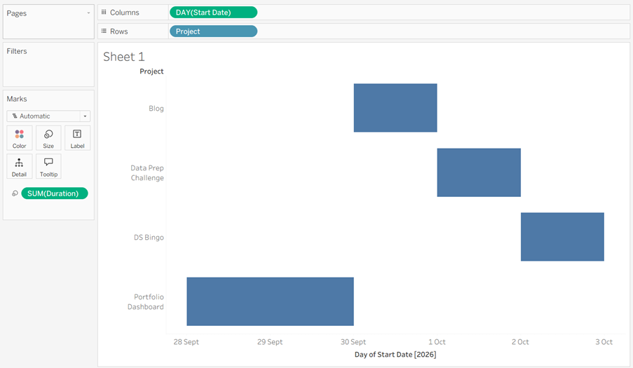
Now all of our projects are nicely filled in.
Reference Line:
The next important thing we need for our Gantt is a reference line which will show today’s date, so that we can keep track of our progress throughout the week.
First, to set up our reference line, we need to set today’s date. We can do this with a calculated field.
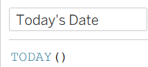
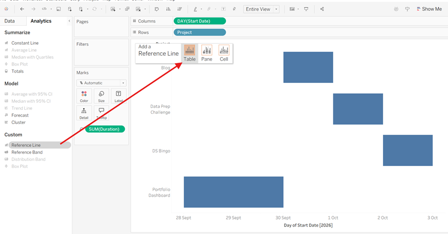
Following this, we go to our Analytics pane and drag the reference line onto our view, selecting table.
We can then select and create a new parameter, give it a name (I chose “Today”), then set “Value when workbook opens” to the Today’s Date calculated field. This will automatically update the position of the reference line based on the computer’s internal clock whenever the dashboard is opened.
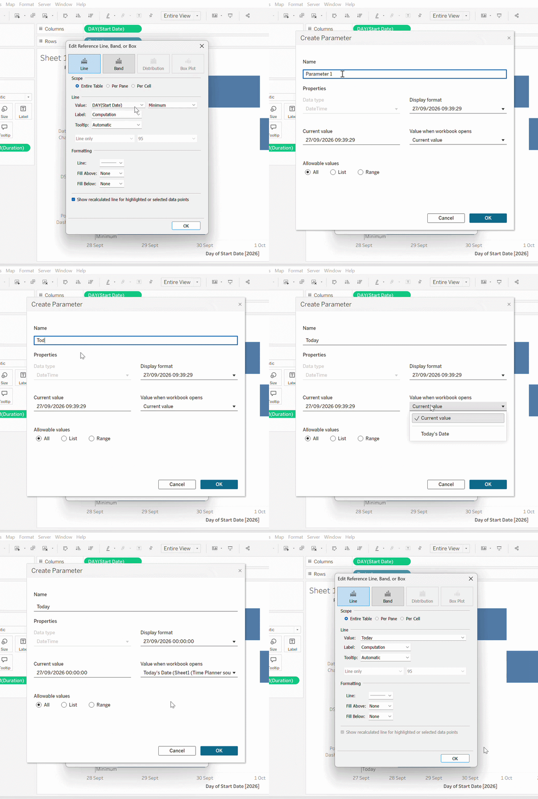
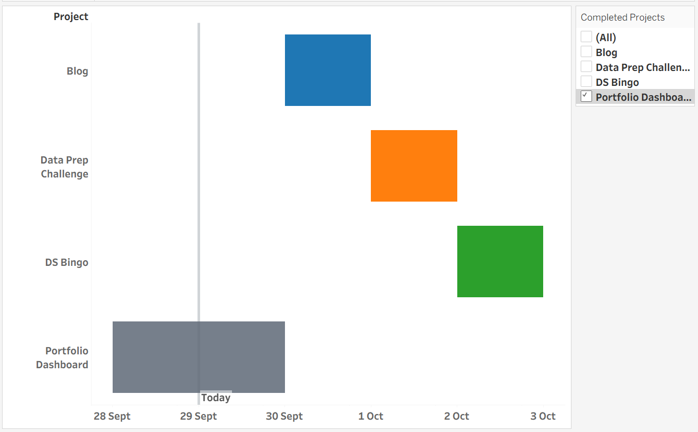
For the sake of demonstration, I have changed today’s date to a date later in the week.
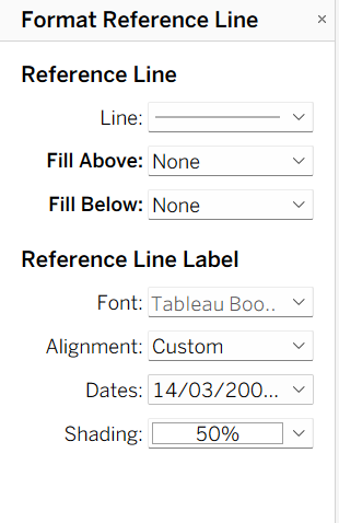
We can further customise the reference line in the Format menu.
Colours:
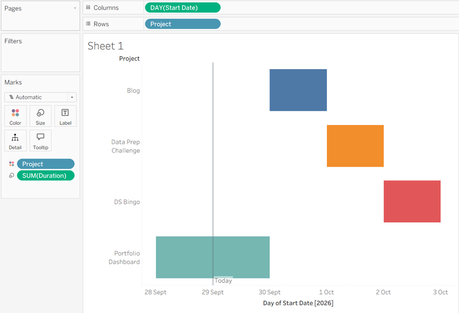
After this, we can simply drag our Project dimension onto Colours to colour-code our projects.
Ticking off tasks:
The next thing we want to do is have some way of showing that we have completed a task, so we can keep track of what we have completed and what still needs to be done.
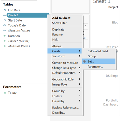
First, we will make a set from our Projects dimension, by right-clicking in the Data pane and selecting Create, Set.
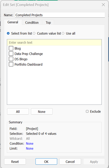
We can call this set “Completed Projects” and, for now, we will leave everything unselected.
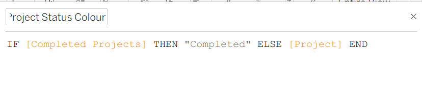
Then we can make a calculated field called “Project Status Colour”. This calculated field assigns the label "Completed" to any project selected in the set, so we can set it a colour.
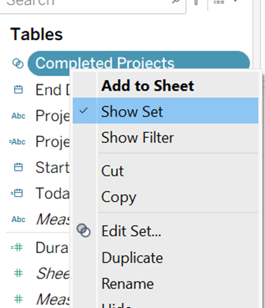
Following this, we drag “Project Status Colour” to Colour, and click Show Set on Completed Projects to show the drop-down checklist.
We can then set the colour for the completed tasks in the Colour mark. I’m going with a shade of grey (you need to select a task to be completed from the drop-down in order to set a colour; you can uncheck it after setting).
Finishing touches:
After setting everything up, we can do a few things to clean up a bit. This is partially based on preference:
· Removed the X-axis title.
· Changed the fonts (I chose Tableau Bold).
· Hid the sheet name.
· Chose specific colours for the tasks.
Next Steps:
It would be great to integrate this into a dashboard with some other time-planning charts and maybe explore more ways of customising the visuals.