


Introduction
After covering fundamentals of data visualisation earlier this week, we had our first day of hands-on learning Tableau Desktop. We covered a lot, including exploring basic functions, useful buttons (that we most likely missed on our application), and creating basic visualisation tools.
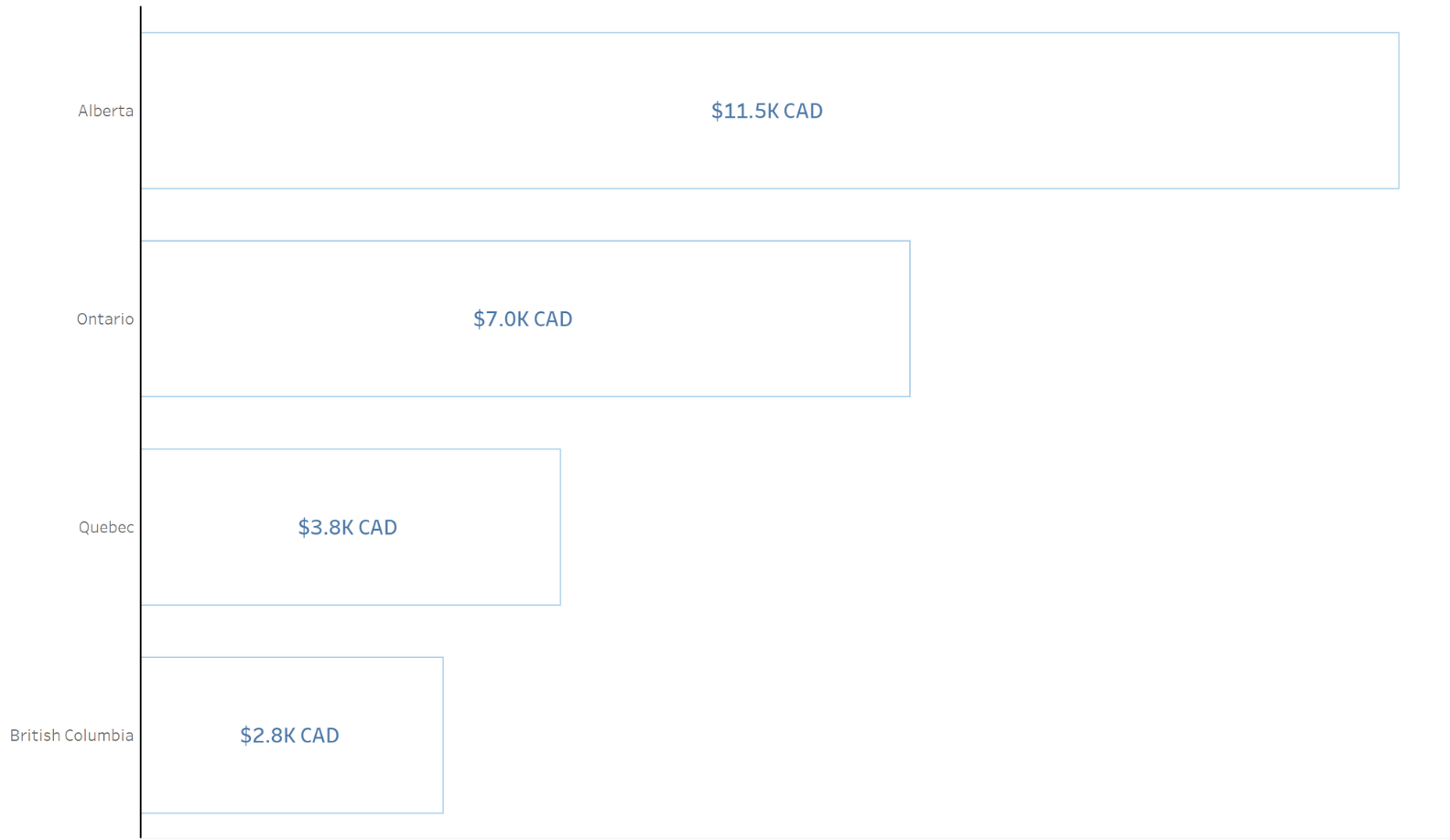
During our last hour of the day, we got some time to get creative with bar charts, one of the most useful and common tools for visualisation that human brains tend to understand. One of my favourite bar charts I created today was an outline bar chart, extremely easy to understand and an effective easy for interpretation. Through the rest of this blog, I’m going to give a tutorial on how I made it (below is the final result).
Tutorial - The Outline Bar Chart
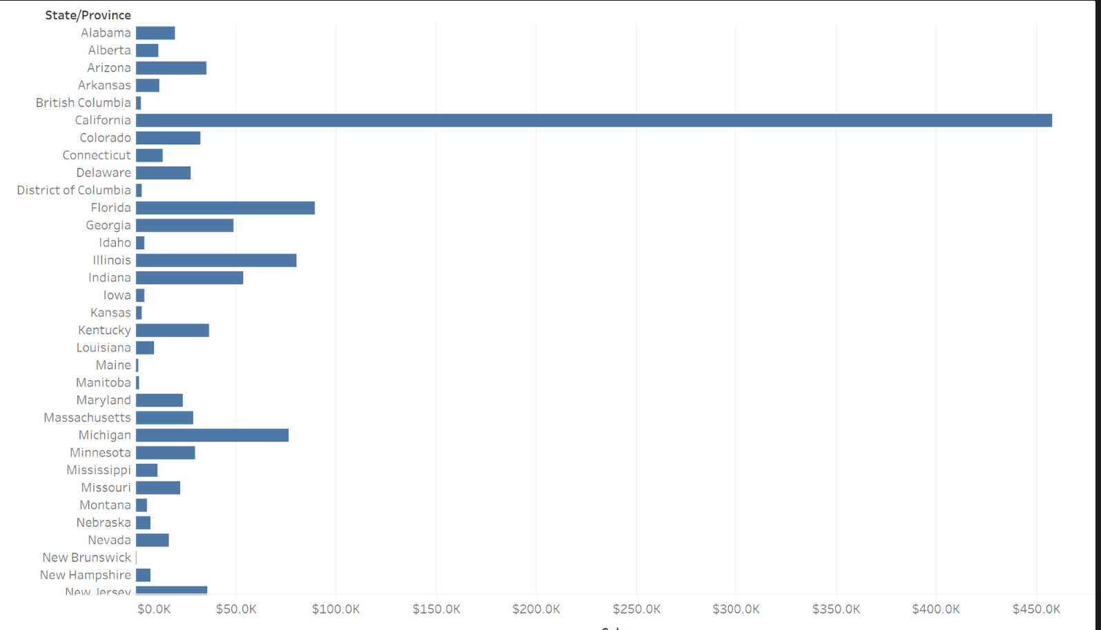
Step 1: Create a Bar Chart
- Drag and drop the desired measures and dimensions into the rows and columns shelf. For the purpose of this exercise, I chose the sum of sales by state.

Step 2: Filter for what we want
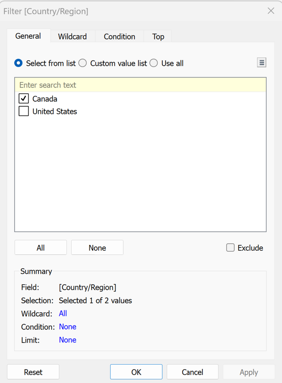
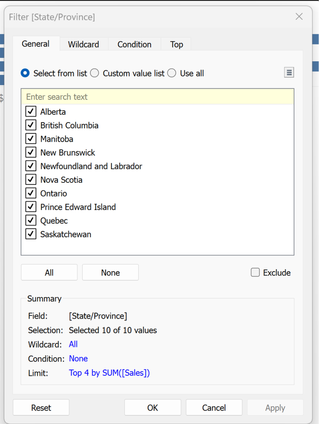
I want to only view the top 4 performing states in Canada, so I need to filter everything else out.
- Firstly drag the Country/Region pill into the filter shelf and uncheck the United States.
- Ensure that the Summary Card section looks the same as below.
- Next, we want to only show the top 4 states by sales to only emphasize the top performing states. To do this, drag the State/Province pill into the filter shelf. Click on the ‘Top’ tab and select ‘By field’. Here, changing the top x number to 4 means only the top 4 performing states by sum will show.
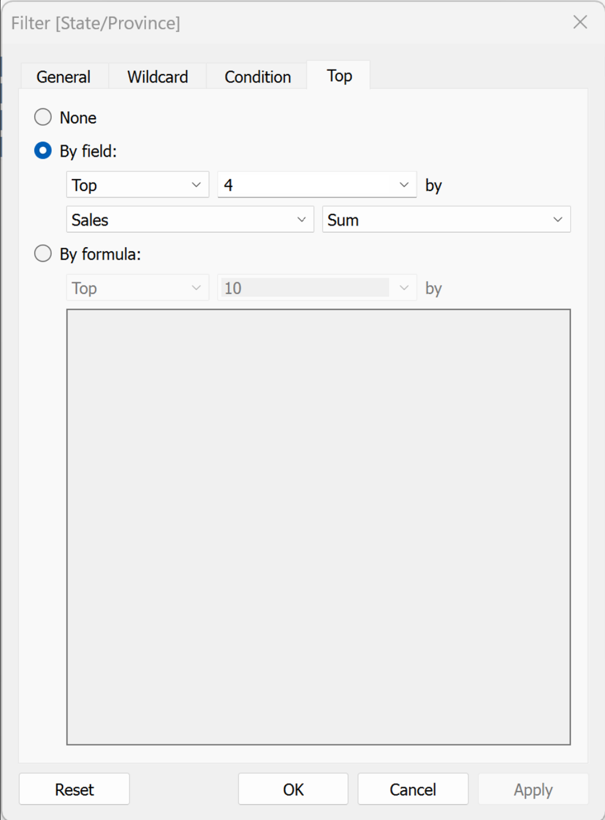
- Ensure however, that when going back to general it looks like this, with the summary card matching. For me, it defaulted to ‘use all’ which caused all states to disappear.
- Replicating the below will cause only the top 4 states to show.
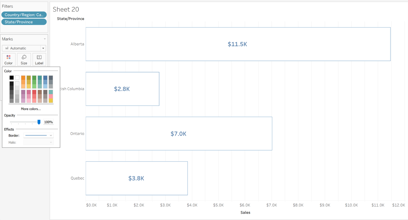
Step 3: Labels
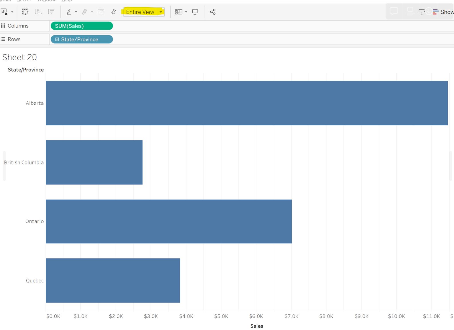
- First change the highlighted dropdown to ‘Entire View’ to fill out the whole page.
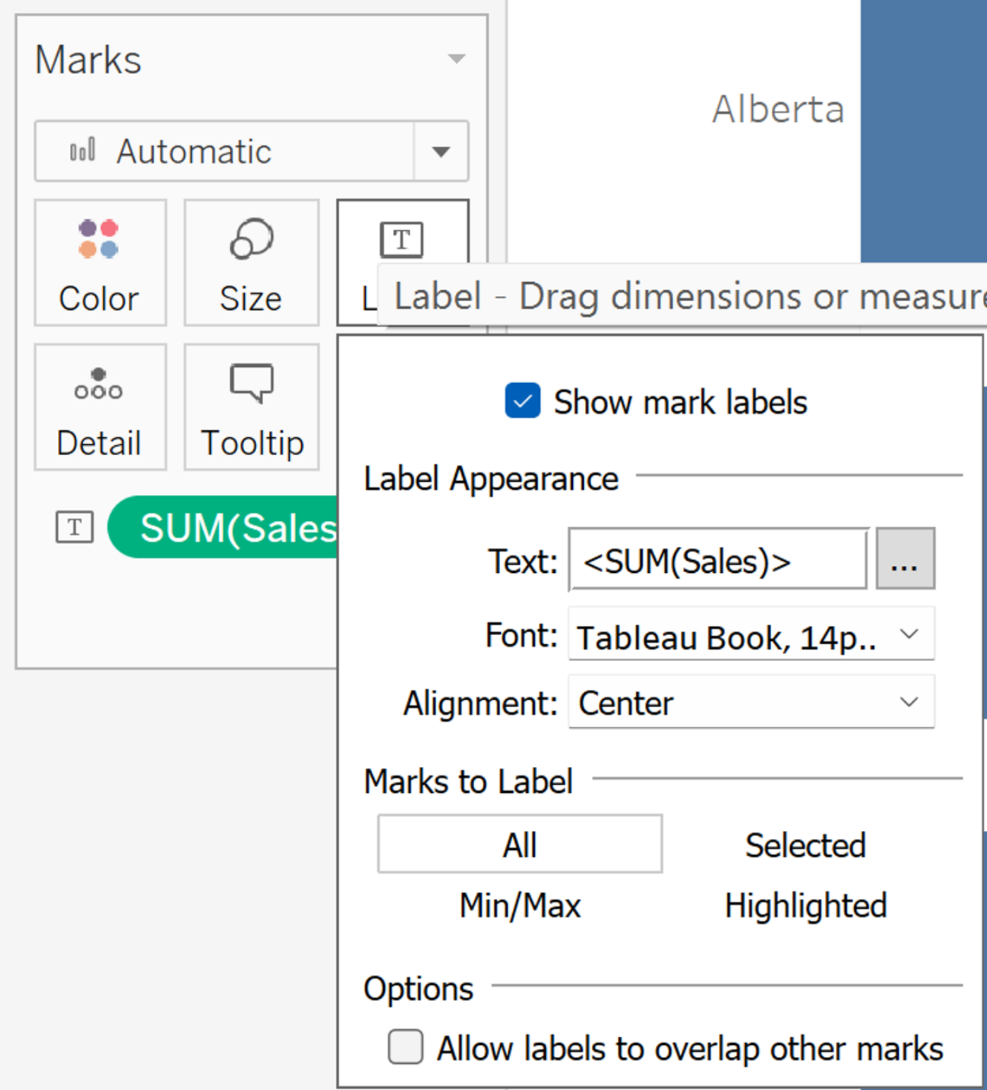
- Next, Press Control and drag the Sum(Sales) Pill into text. Align it to the center and format how you deem appropriate.
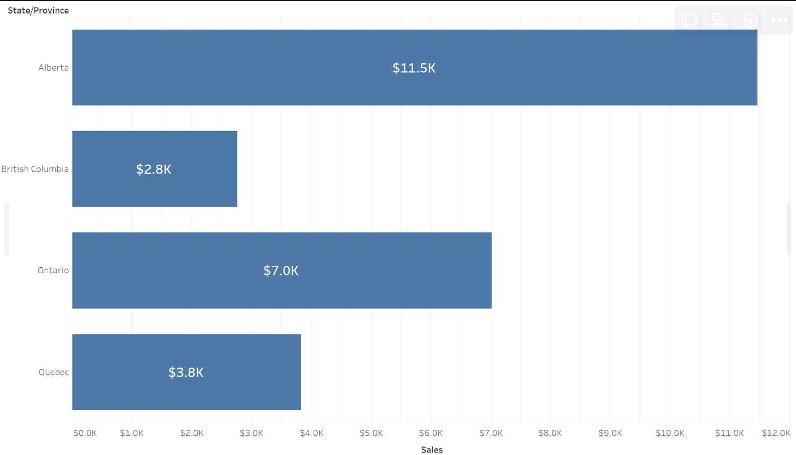
Following these steps will result in the following
Step 4: Colour, Reference Lines & Order
- Go to colour on the marks card and change the colour to white, then change the border colour to blue.
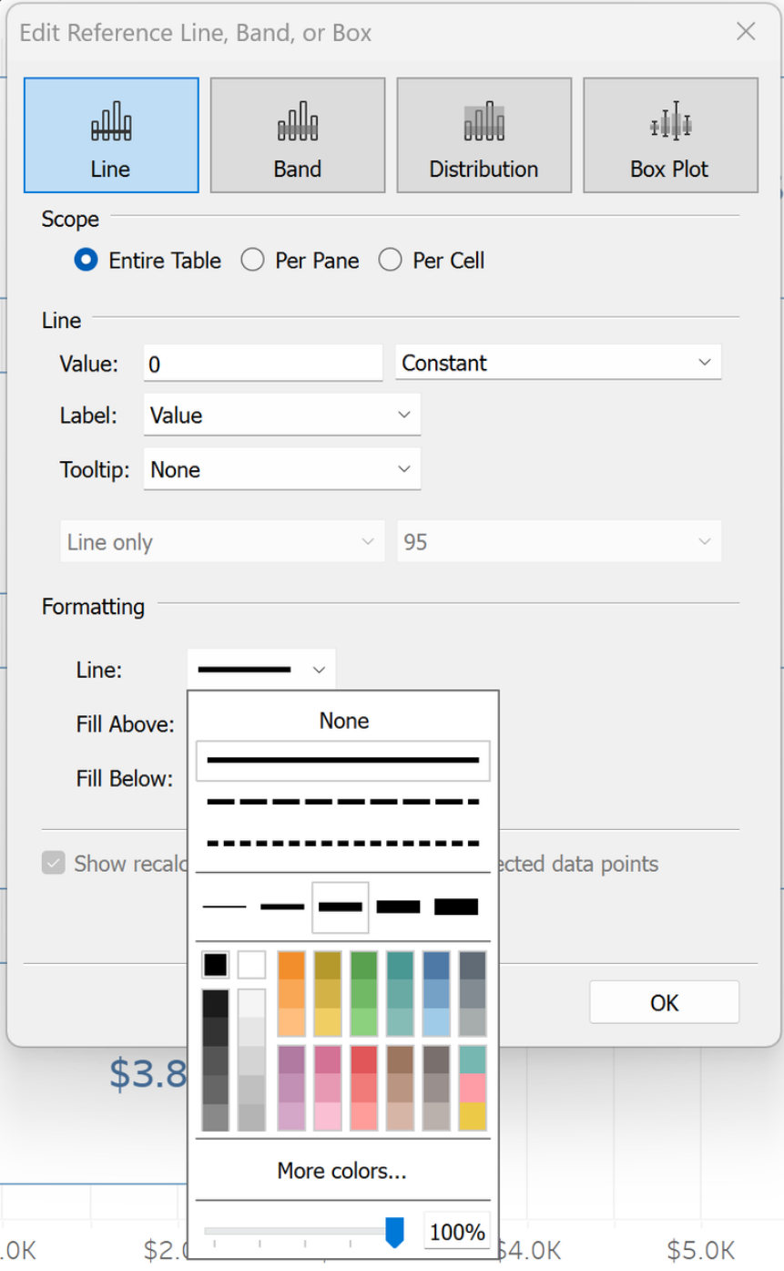
- Go to the analytics pane, click add reference line and apply to to the entire table.
- In the Line section, change the right dropdown box in ‘Value:’ from average to Constant, and change the value to zero.
- In the formatting section, change colour to black, increase the thickness and increase the opacity to 100%.
- Press the sort button (highlighted below) to sort in descending order.
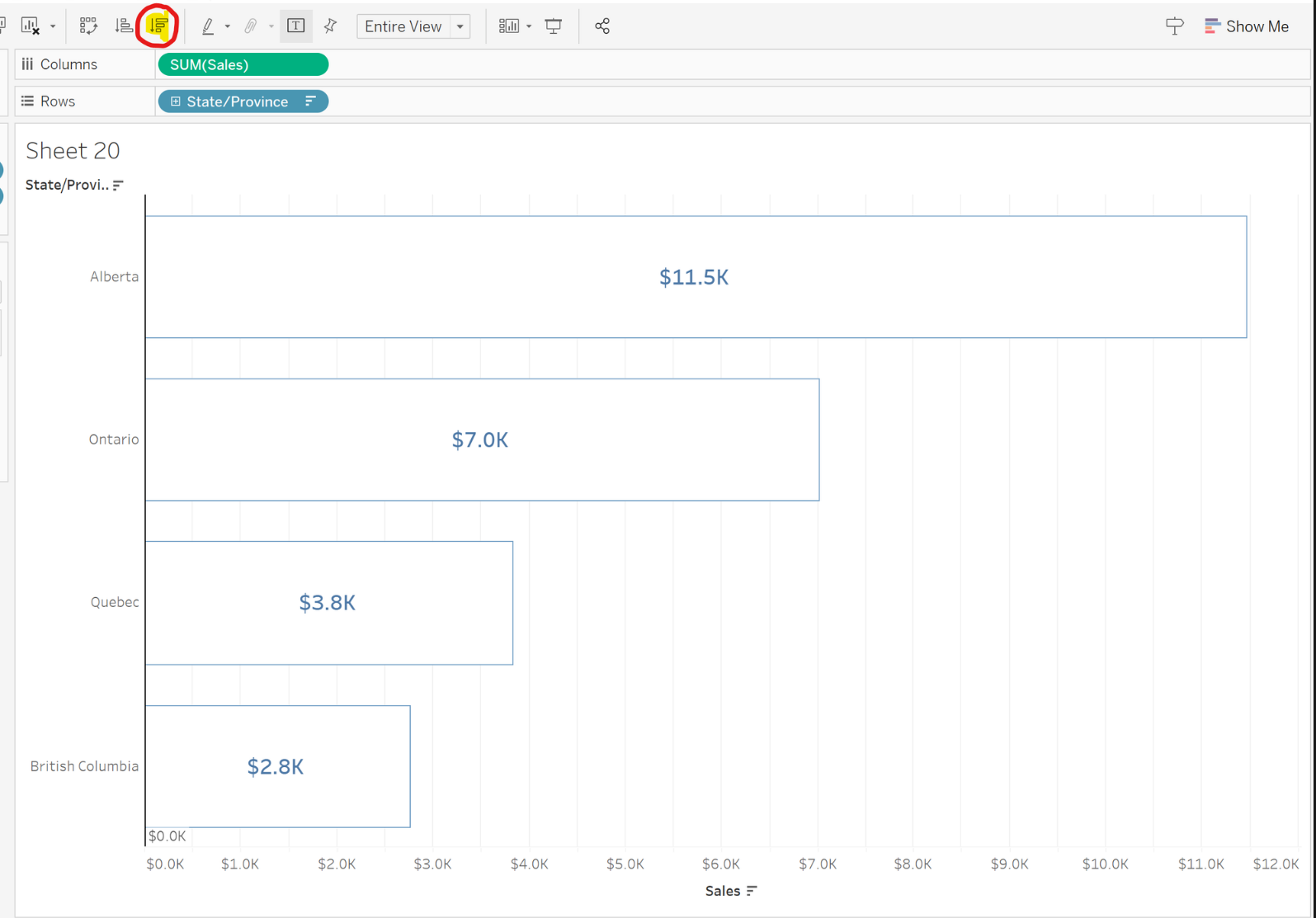
Now you have an Outline Bar Chart!
Note, if you wish to format the chart further, e.g. by removing grid lines, right click on the chart and format further as you wish.