I created a circle timeline using Tableau for my second interview project in application of The Data School at The Information Lab. And I'd like to revisit it so I can better remember it for future reference.
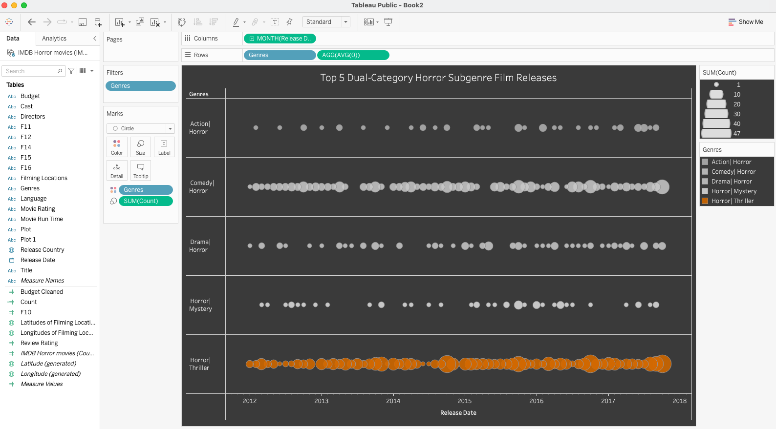
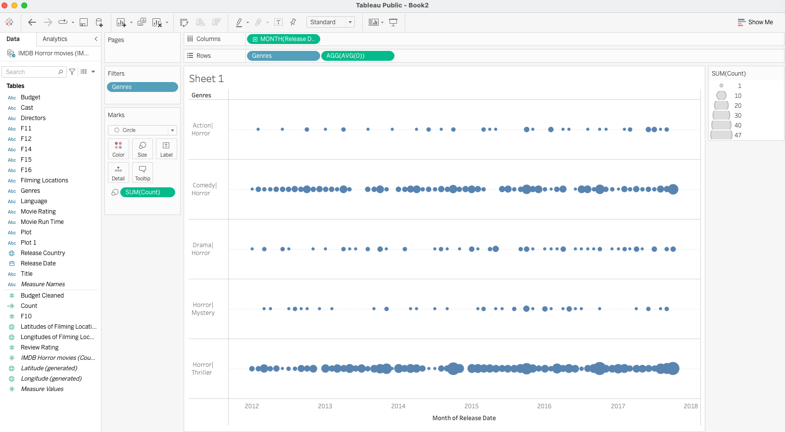
This is my circle timeline on my Tableau dashboard that described the number of releases for the top five dual-category horror sub-genre films from 2012 to 2018.
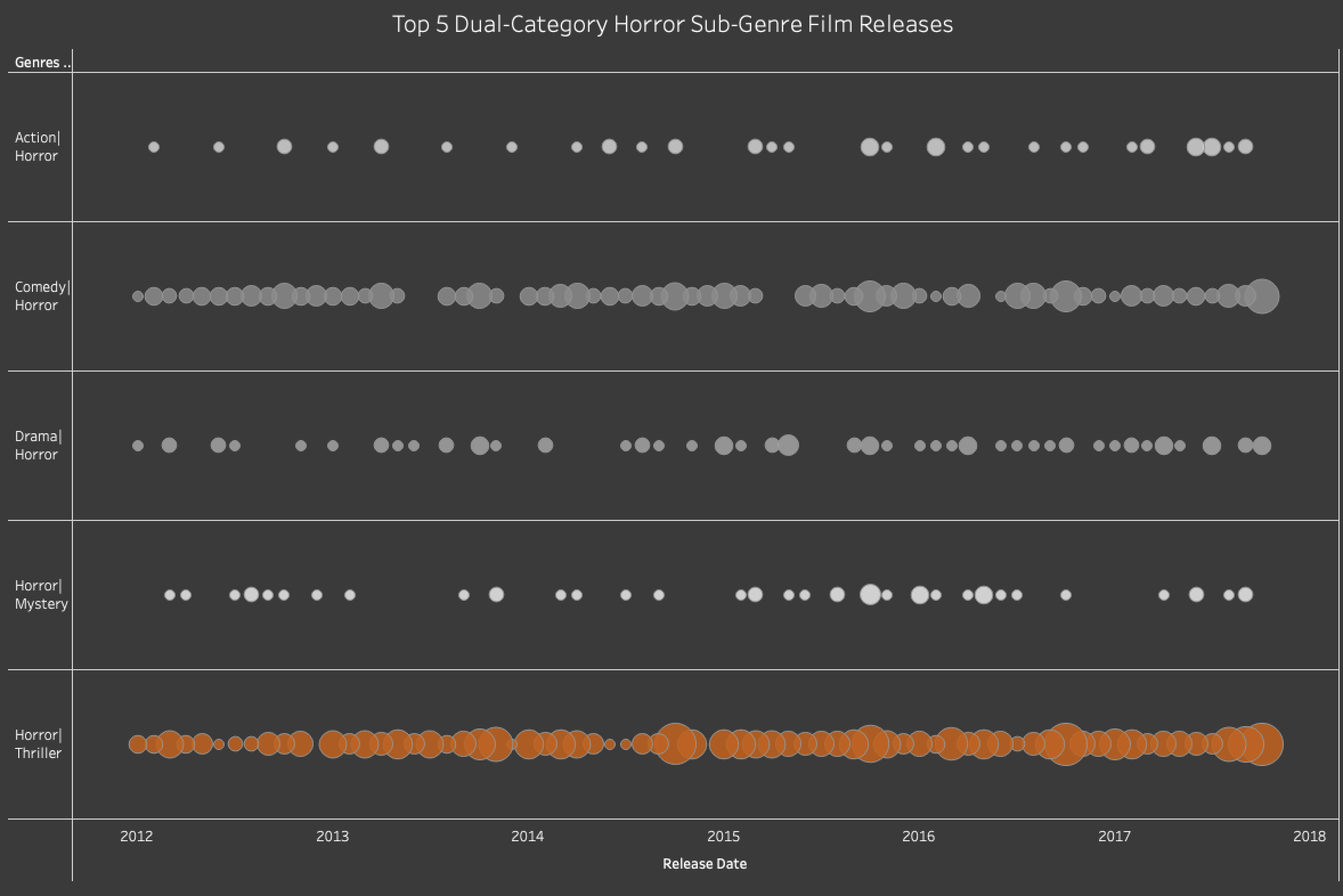
First of all, a definition: A circle timeline, also known as a bubble timeline, is a method for showcasing a sequence of dates along a timeline where circles of varying sizes represent the data. These circle sizes are determined by a specific measure. Additionally, another measure can be optionally used to assign different colors to these circles.
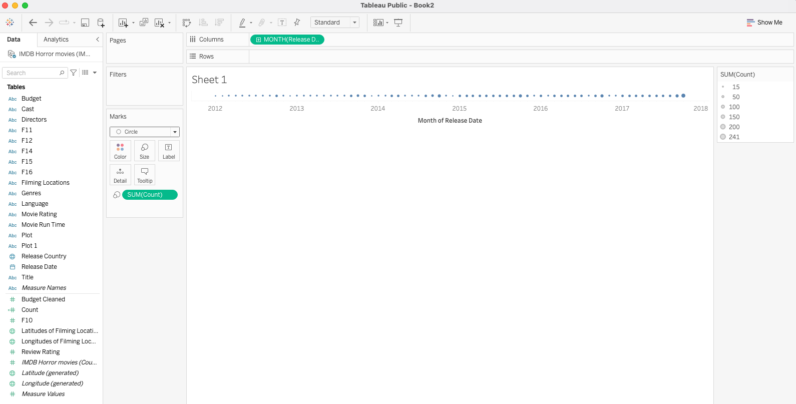
To create this circle timeline, I first dragged the Release Date data into Columns (of a Tableau Sheet) and selected Continous Months (by clicking on the drop down arrow of Release Date [Year]). Then, I dragged a calculated field Count onto the Size shelf and selected Marks on the drop down from Automatic to Circle.
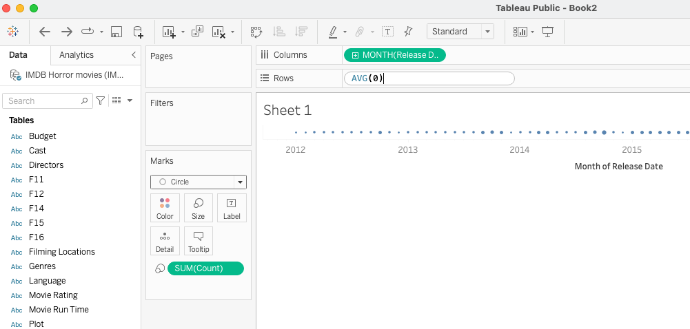
Then, I created an in-shelf calculation by typing Avg(0) in Rows.
Hide the header for the AVG(0) by right-clicking it and uncheck "ShowHeader." Remove it from the tooltip by clickin on the drop down arrow of the AVG(0) pill and uncheck "Include In Tooltip." Drag Genres into Rows and filter to the top 5 (in Count) of the 16 dual-category horror subgenres. Adjust the size of the circles by clicking on the Size shelf and move the sliding bar so that they overlap a bit.
Drag Genres over to the Color shelf to differentiate the various horror sub-genres by color.
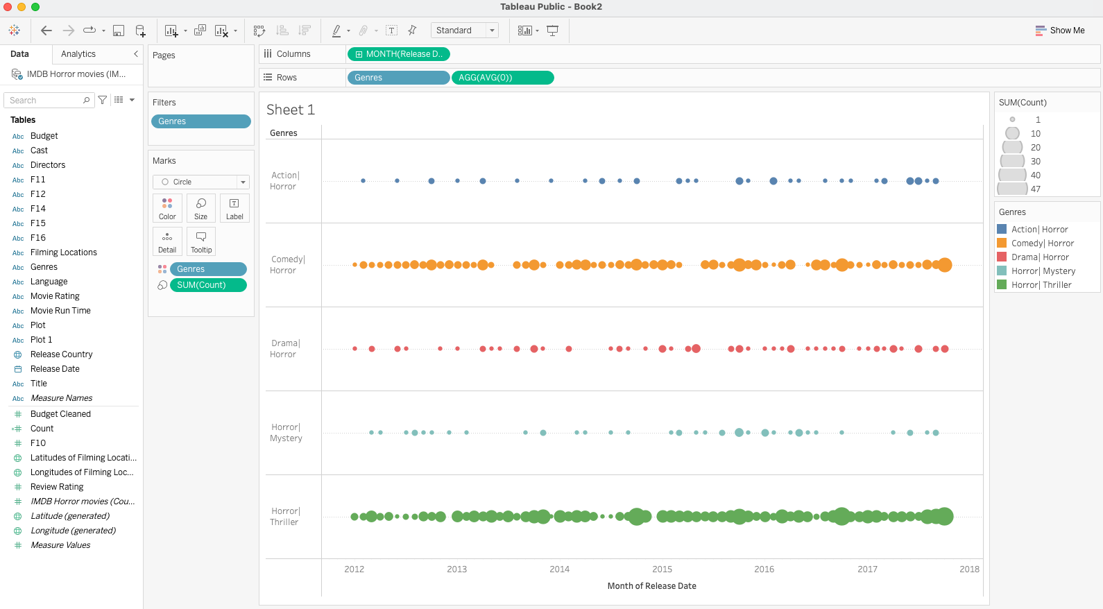
Click on the Color shelf to adjust the colors - I wanted to highlight the horror-thriller subgenre in red and all other subgenres in gray because this genre had the most horror film releases in this time period. Also in the Color shelf, you can add some transparency and borders to the circles. Format the graph (right-click it and Format...) and select the paint bucket icon and darken the worksheet. Adjust text color for enough contrast with the background. Select lines icon and remove the Zero Lines (choose None). Properly label the graph and your circle time line is ready for input to the dashboard.