


This week of training highlighted that not all data communication is the same. As consultants, our job is not only to analyse data but to help clients make sense of it. A key part of that is choosing the right way to communicate insights for the right audience, whether through an exploratory or explanatory approach.
Exploratory
The exploratory approach is focused on discovery. It allows users to interact with data, slice it by different dimensions, and uncover insights that are most relevant to them. This works well for audiences who are familiar with the data, have time to investigate, and value flexibility in how they explore information. However, it can be overwhelming for users who want quick answers or are less comfortable with technical tools.
Techniques for effective exploratory design include:
- Providing clear instructions or guidance for navigation
- Keeping interactivity purposeful and easy to follow
- Maintaining sensible limits on filters and access
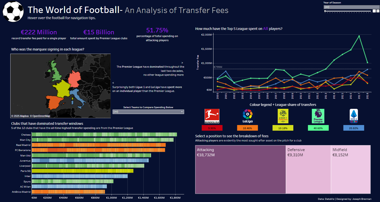
A great example of an Exploratory Dashboard is this one below by Joseph Brennan on World Football Transfers
Explanatory
The explanatory approach focuses on storytelling. It presents data within a clear narrative, summarises key findings, and highlights what matters most. This approach is ideal when the audience or purpose is well-defined and when users need concise insights quickly. It works best for presentations, reports, or summaries where clarity and focus are the priority.
Techniques for effective explanatory design include:
- Using statement titles and annotations to highlight insights
- Grouping related content logically
- Summarising conclusions clearly and keeping visuals uncluttered
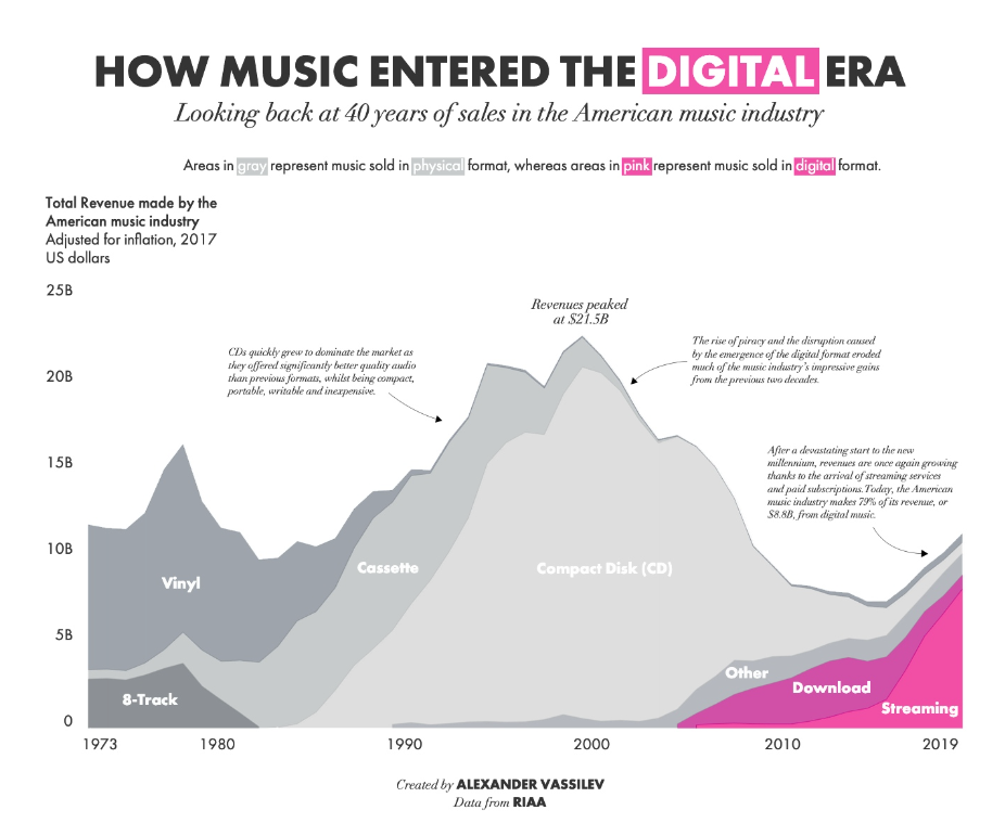
A great example of an explanatory dashboard is this one below by Alexander Vassilev on the American music industry's shift to digital:
Final thoughts
Understanding when to explore and when to explain has shown me that data visualisation is not just about showing numbers but about communicating meaning in the right way for the right people.