


The Brief
For Dashboard Week Days 4 and 5, DS54 analysed the history, performance, and growth of English women’s football using match data from the Women’s Super League and Women’s Championship.
Across two days, the task was to build two complementary Tableau dashboards that together told a clear, story-driven narrative. One dashboard needed to provide a high-level overview, setting context and highlighting key trends, while the second was expected to zoom in, building on insights introduced in the first with more detailed analysis. The analytical direction was intentionally open-ended, allowing consultants to choose a topic or team that interested them.
I chose to focus on Chelsea Women. As a Chelsea fan, this felt like a natural decision, but it was also a chance to work with women’s football data, which I had far less exposure to compared to men’s football. Given that the brief explicitly allowed a single-team focus, I knew early on that this was the angle I wanted to take.
My Approach
Going into Days 4 and 5, I carried forward the same approach that worked well for me earlier in the week: spending significant time planning before building. I didn’t feel the need to experiment wildly with interactivity or advanced features. Instead, my priority was ensuring the dashboards told a clear and coherent story.
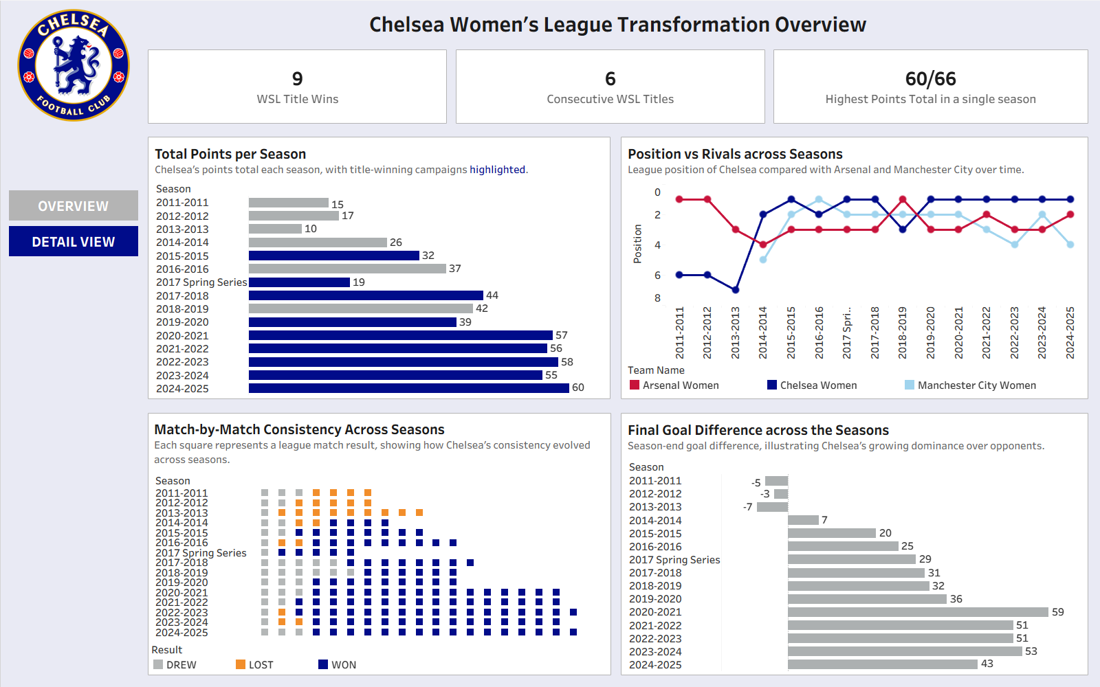
The central narrative I wanted to explore was Chelsea Women’s transformation over time. In their early WSL seasons, Chelsea were relatively mid-table and inconsistent. Over the years, they evolved into a dominant force, winning the vast majority of recent league titles and establishing themselves as one of the strongest teams in women’s football.
To reflect this progression, I structured the work as follows:
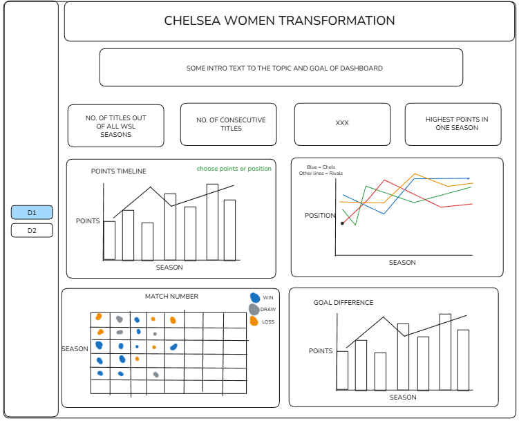
- Dashboard 1 (High-level context): Chelsea’s league performance over time, focusing on metrics such as league position and points to show the shift from mid-table team to consistent title winners.
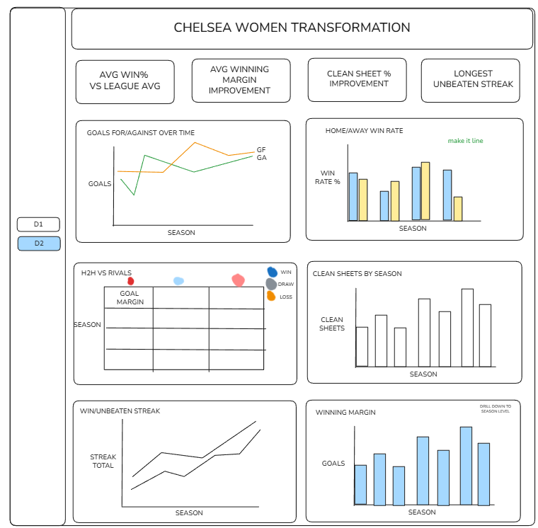
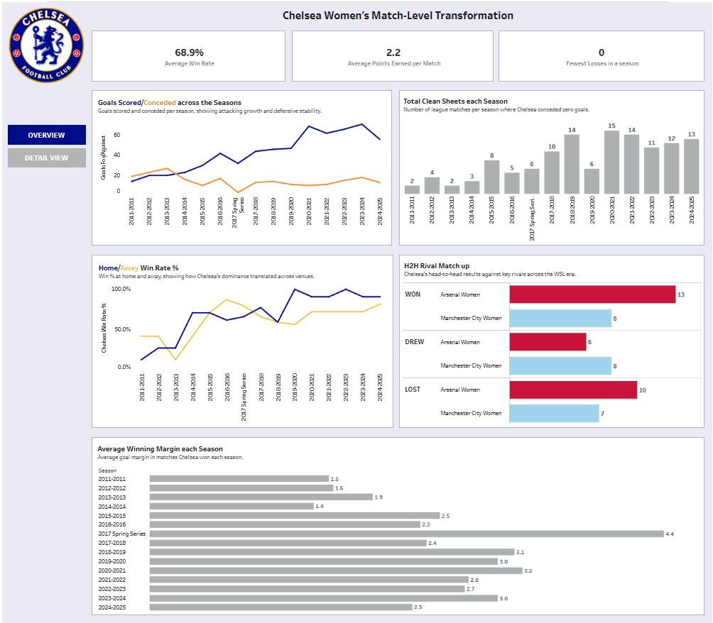
- Dashboard 2 (Deeper insight): A more detailed, match-level view looking at performance indicators such as goals scored and conceded, win rates, win margins, and match results to help explain how that dominance manifested on the pitch.
I didn’t have a tightly defined user persona in mind. The dashboards were aimed more towards someone already familiar with women’s football, with the goal of clearly visualising Chelsea’s rise and sustained success rather than introducing the league from scratch.
Planning and Design Decisions
I sketched out both dashboards before building anything in Tableau. This helped me be decisive about what charts I needed and, just as importantly, what I didn’t. Because the story was the main focus, I deliberately kept interactivity to a minimum and relied on the charts themselves to communicate the insights.
Metric selection followed naturally from the narrative. League position and points helped establish long-term context, while goals, defensive record, win rates, and margins provided evidence of dominance at the match level. Planning upfront meant the build phase was much smoother and more focused.
Final Dashboard
Challenges
The biggest challenges were both technical and conceptual. On the technical side, I needed to work out how to build the specific charts I had in mind and create the necessary calculations. On the conceptual side, I occasionally questioned whether certain charts were truly helping tell the story.
A recurring challenge for me is trusting my own judgement. I found myself second-guessing decisions, but at some point I had to commit, build, and move on. In this case, trusting that instinct paid off. Even if a decision hadn’t worked, it would have been better to learn from it than to stall for too long.
Personal Reflections
This project was easily the most enjoyable of the week. I want to work in football analytics, and being able to analyse football data, particularly women’s football, was genuinely motivating. Most of my previous experience has been with men’s data simply because it is more readily available, so working with WSL data felt refreshing and exciting.
More broadly, this task made me reflect on how far I’ve come since the start of training. I don’t think I would have been able to design or build these dashboards earlier on, and recognising that progress was reassuring.
It also reinforced what I enjoy most: building charts and visualisations that tell a story. While I am capable of handling data preparation, I’m still building the same level of confidence in that part of the process that I have with visualisation. With more time and practice, I’m confident my data prep skills will reach the same standard. Going forward, I want to do more projects like this and continue developing a football-focused portfolio.
One key habit I want to carry forward is my planning-first approach, along with being more comfortable letting go of ideas that aren’t working. Making decisions quickly, rather than getting attached to a single idea, has made my work more effective and far less stressful.