


The Brief
Day 1 of Dashboard Week started with a challenge of using Transport for London's Santander Cycle Bike Point API. The task involved building an interactive journey planning dashboard to help users find available bikes and empty docking stations across London.
The Task
- Connect to the TfL API and retrieve Bike Point data using Alteryx
- Clean and structure the data for analysis
- Build a Tableau dashboard that answers:
- Which Bike Points are near my start/end location? How many bikes or empty docks are available?
- Present at 3:30 PM
My Approach
I started by tackling the data prep in Alteryx. The workflow was straightforward enough; text input for the API URL, download tool to retrieve the data, then multiple JSON Parse tools to extract everything from the nested brackets. After that I cleaned up headers and removed unwanted fields.
The main challenge came with the Download tool configuration. I couldn't deselect DCM as it wasn't an option. After troubleshooting with Ollie we discovered the issue was in my Alteryx user settings where I had DCM only mode applied. Once we changed that setting everything worked fine.
Another frustration was keeping track of field names during JSON parsing. The automatically generated names get long and confusing making it difficult to remember what each field represented.
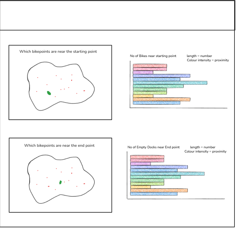
For planning the dashboard I was a bit lost on direction. Given it was the first day of the week I decided to just stick to the brief and build around the four core questions provided. I created a quick sketch based off these questions on the charts I want use to answer these questions, which gave me a clear framework and ensured I met all the requirements.
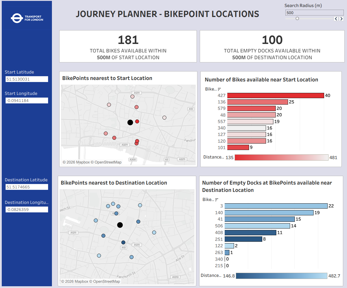
The Final Dashboard
The final dashboard stayed true to my original sketch with the four core visualisations. The black dot on each map represents the user's starting or destination point with the surrounding points showing bike stations within the selected search radius, which can be adjusted using the parameter at the top. The bar charts show the top 10 nearest bike points where the bar length indicates the number of available bikes or empty docks and the color intensity represents how close each point is to the user's location.
Feedback
During the presentation I received some valuable feedback. Using Bike Point ID as the axis made it difficult for users to identify locations without hovering over the bars, and using street names or area labels would have been more intuitive. Another point raised was that most users won't know their exact latitude and longitude coordinates but they will know their area or street name, so allowing users to select their location this way would have made the dashboard much more practical for real-world use.
Personal Reflections
I tend to feel overwhelmed when starting projects like this. All my knowledge seems to go out the window and I freeze up or fixate on problems for too long when I should just move on. I feel like I could have designed the dashboard better, my design skills are improving but I still let myself down a bit today. Part of this comes from being less confident in data prep since it takes me time to get my head around things in Alteryx, which eats into my dashboard building time. I'm planning to spend time on the bench from next week focusing on improving my Alteryx skills so I feel less anxious tackling these tasks in future. Overall it was an interesting first day and I'm taking the lessons learned into the rest of the week.