


Today, we were tasked with rebuilding an iconic viz in Power BI. This challenge was interesting as it pushed us out of our Tableau comfort zone and made us think more deeply about how the different dashboarding tool at our disposal really work.
Here is the viz that I decided to recreate:
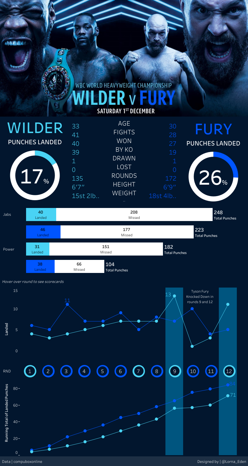
This viz was made by Lorna Brown with data from compubox data and summarizes the epic bout that saw Tyson Fury and Deontay Wilder (both undefeated when they first faced each other) draw after 12 rounds of fantastic boxing. Click on this link to see this viz in tableau public.
And here is my recreation of it.
Today was a day full of new challenges, and I will now walk you through the most significant one!
First challenge: getting the data.
The Tableau packaged workbook I downloaded did not contain all the necessary data for this dashboard and I had to do a lot of digging before I could actually start dashboarding. I did learn how to convert an image into a usable data table (csv or xlsx) which was interesting and probably useful in the future. The final solution I found was to redownload the packaged workbook from my Tableau public account. For some reason, I managed to extract the data that time around and I could start dashboarding.
Second Challenge: Canvas setting
I previously thought that the canvas size was fixed in Power BI but after some investigating, I realized that it could be set to a custom size. This was useful as the viz I was trying to recreate was long and fin (as opposed to the short and wide default powerBI canvas setting)
Third challenge: Image and text
A pretty straightforward part of the challenge. I simply copy pasted the text from the original Tableau dashboard and did a little bit of formatting. Job done.
Fourth Challenge: Donuts Charts
Much easier than Tableau. Simply choose the chart type (that is native to Power BI) and insert your fields. No need for placeholders, dual axis, or axis synchronization!
Fifth Challenge: Stacked Bar charts
I had trouble getting two measures on the x-axis until I figured out you could control the hierarchy on the top right of your graph.

It was not as easy to organize and color the bars as I desired. I ended up having to compromise on the original design.
Sixth Challenge: Line graph
By far the most intimidating graph in this dashboard. This graph required data transformation and a good deal of formatting. In particular, I created a quick calculation to calculate the running total of punches landed. I found that the quick calculation worked well but was limited when compared to Tableau (not possible to calculate by pane/cell/column/specific field). I struggled to format the line graph and abandoned the labeling part of the graph (much like you would do it in Tableau, it would have required calculating the max and min value for each line and adding the new calculated field to the view). However, I found it easy to add markers to the line graph. To underline the 9th and 12th rounds (where Tyson got knocked down), I struggled to create bands like you would in Tableau and opted for a more simple approach by inserting a rectangle shape and reducing the opacity.
Seventh Challenge: Circle Scatterplot
This last part of the dashboard necessitated embedding a page in a tooltip. I found it impossible to reproduce the exact tooltip Lorna created because of the size limit imposed by Power BI on embedded tooltips. I hence proceeded to create a bar chart summarizing the average score given by the 3 judges for each round. Overall, I found the process of embedding a page into a tooltip more complicated and limiting than in Tableau.
What lessons did I learn from recreating this Dashboard?
This challenge was truly instructive and allowed me to better understand the weaknesses and strengths of Tableau and Power BI. Although similar in many aspects, I could really feel the difference in both tools' interfaces. Love it or hate it, you can really feel Microsoft's enprints in Power BI. This makes Power BI very easy to pick up and use with little to no training. I personally think that the Microsoft ecosystem and the ease of use of Power BI are the tool's strongest points and I do see use cases where Power BI outshines Tableau. On the other hand, I found Power BI less flexible than Tableau and I found the interface less intuitive at times (I am probably bias on that one). The Tableau community also appears to be stronger and although the learning curve is steeper, the support you get along the way is better than what I found scrolling away in PowerBI help forums. At the end of the day, I think the both tools are designed for very different users, Tableau being more creator-friendly while powerBI is more user/viewer friendly.