Today’s challenge was to pick one (or multiple) API’s of your choice to pull your data from and use to build a Tableau, Power BI workbook or Alteryx App that outputs interactive charts & reports.
1) Get my API key
simple as signing in and waiting for an email with your unique API key
2) Understanding documentation
This part took a while but it was definitely worth it. Understanding how the API is set up and what URL to query is crucial and it will save you time down the line. By reading the documentation today, I realized that some of the features were deprecated which later enabled me to fix an issue I was having with certain rows being empty where I would have expected them to be populated.
3) Download and Parse
Here the crucial part was understanding the structure of the data that I was getting back. I spent a good amount of time thinking about the columns I would need and
4) Data Prep
Building the workflow was pretty straightforward after that. I had a little bit of spatial manipulation to do (creating polygons, points, and lines as well as calculating areas and lengths) but the main hurdle was to keep my different workflow organized and, building on yesterday's lessons, remembering to cache my workflow before I ran it.
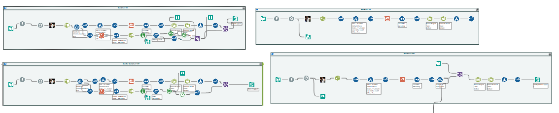
Using containers was also very useful in today's challenge as it allowed me to decide which workflow I was going to run without having to open different workflow pages. This simple feature saved me a lot of time and processing power!
5) Plan of action
Once I had explored the API and zoned into the data I was interested in, I drew a quick sketch outlying what I wanted to achieve with my viz.
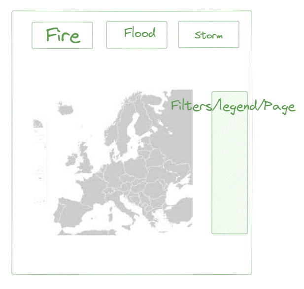
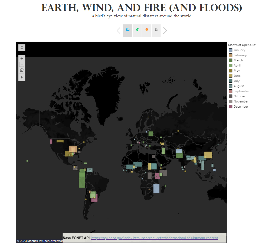
For this viz, I wanted to let the map do the talking and have one main map for each natural disaster I was going to analyze. I used a story to switch from disaster category to disaster category.
Because it was my first time using story in tableau I did not realize I could put a dashboard inside a story and if I could do it again, I would probably build supporting graphs to add more context to my dashboard.