


Today, we were tasked with a simple challenge: making a dashboard using information from the pudding boyband database. The only caveat was that we only had 3 hours to do it.
I started by downloading the data and giving the documentation a thorough read. I realised that, although the dataset contained a lot of information on the band members, it had very little information about the songs that made these bands famous in the first place. To solve this injustice, I called upon a now familiar friend, the Alteryx chat GPT completion Macro. If you want more information on how to use this macro, consider reading the blog I wrote about it.
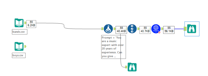
For this workflow, my prompt was fairly simple:
'You are a music expert with over 20 years of experience. Can you give me a short explanation of the lyrics of the song ' + [highest_song] + ' by ' + [band] + ' which hit the bilboard in ' + [highest_pos_date] + '. Do not explain what you are doing and focus on the main themes of the song. Your answer should not be longer than 100 words.'
After running the workflow and joining the resulting dataset to the original one, I was left with 55 detailed descriptions of the songs in our dataset.
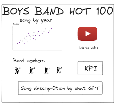
I then quickly draw out a sketch of what I wanted to do in this dashboard. My idea was to centre the dashboard around the hit/the song and enable the user to filter through a scatter plot showing song position in the billboard by year.
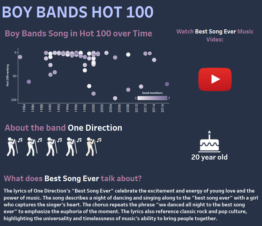
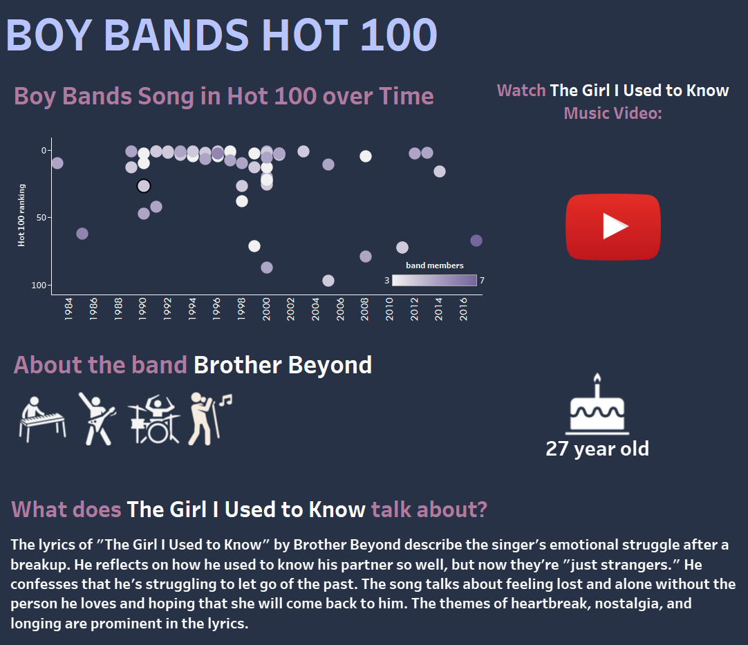
The plan was to give a description of the selected song's band and themes as well as a link to the music video. The dashboard creation went surprisingly smoothly as I used the URL dashboard action to embed the link to each music video of each song and downloaded custom shapes to describe the role and skin colour of each boy band member in the dataset.
Dashboard for One Direction
Dashboard for Brother Beyond
Lessons and potential improvement:
Although we were short on time, I think this dashboard turned out fine, and I am particularly satisfied with its simplicity. Learning how to use the URL dashboard action and being able to use the chat gpt completion macro to generate a large amount of text in a very short amount of time was also rewarding.
On the other hand, I believe this dashboard could be improved by incorporating more graphs and analysis. As it is, the dashboard is very exploratory and it could be made more insightful with the addition of exploratory analysis. Formatting is always a lengthy process and I think this dashboard could be reformatted to be more impactful and visually appealing.