1. Introduction
Are you looking for a way to add some pizzazz to your Tableau visualizations? If so, then you’ve come to the right place! In this blog, I am going to show you how to create animations in Tableau and bring your bar chart to life! A chart animation is a great way to show changes over time and make your data easier to quickly understand and interpret.
Step 1: Build a bar chart
The first step when creating a bar chart animation in Tableau is to build a bar chart. To do so, you can choose any dataset you like, either from a public data source or create your own. Note that you will need a minimum of three columns of data to create the animation: 1 discrete variable (ex: countries), 1 continuous variable (ex: potato production), and 1 date field.
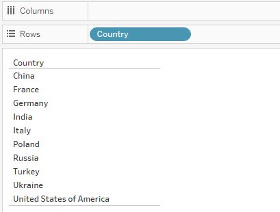
Once your data is loaded into Tableau, drag the dimension you want to display on the x-axis to the Columns shelf. For example, if you want to create a bar chart showing potato production by country, drag the "Country" dimension to the Columns shelf.
Drag the measure you want to display on the y-axis to the Rows shelf. In our example, you would drag the "Potato production" measure to the Rows shelf.
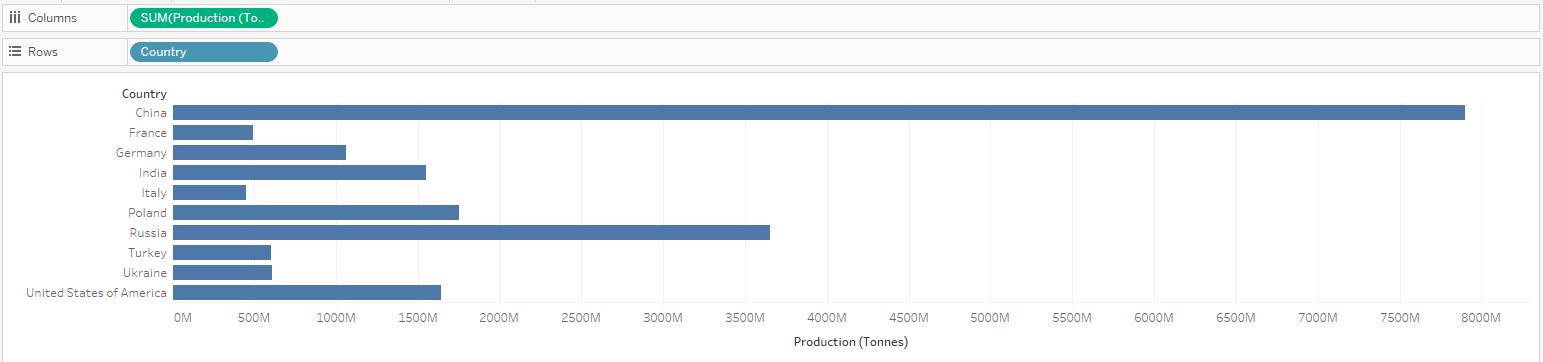
Tableau will automatically generate a bar chart based on the dimensions and measures you've selected. You can customize the appearance and format of the chart using various options in the "Marks" card.
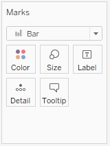
To add additional details or insights to your chart, you can drag additional dimensions or measures to the "Color," "Size," or "Label" shelves. For instance, you can add a "Category" dimension to the Color shelf to differentiate sales by category within each region. You can further refine your bar chart by adding filters, sorting the data, or adding additional layers to the chart using the available options in Tableau's interface.

Step 2: Create your animation
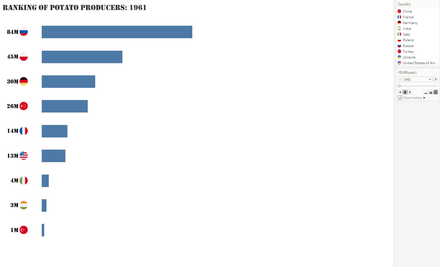
You now have built the bar chart of your dream. To add interactivity to it, you can use the Pages shelf to break down the bar graph by individual time period or dimension member (which represents a single “page” in the shelf). To do so simply drag your year field and drop it into the Pages shelf.
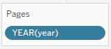
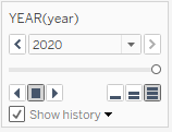
On the left side of your graph, you will now see the Pages shelf. Click on the arrows or use the slider to navigate through the different pages and see the animation effect as the bar chart updates based on the selected dimension member.
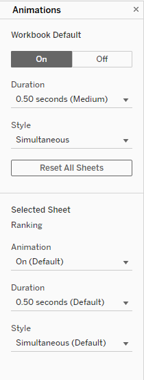
To customize the animation, you can adjust the timing, transition effects, and other settings in the animation shelf. To access these options, click on format, and then on format.
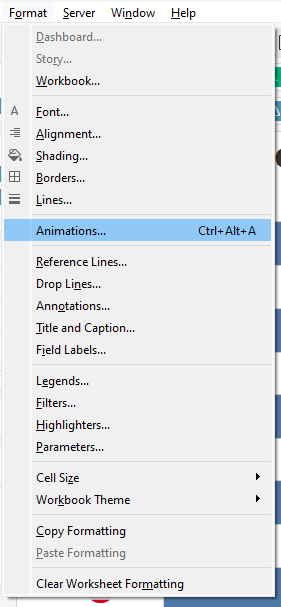
You now have access to different settings to adjust the duration and style, of your animation.
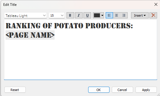
Bonus: To keep track of the year you are visualising in your animation, you can insert <page name> in your title or as an annotation in your chart.