


This dashboard week task was a 2 day challenge. We were given 2 days to prep the data and complete the brief.
The Brief:
The group has been provided with three datasets covering all matches played:
- Since 2011 for the Women’s Super League
- Since 2014 for the Women’s Championship
The datasets are:
- ewf_matches
- ewf_appearances
- ewf_standings
The data is sourced from the English Women’s Football Database. Using the data provided, and any additional data of their choosing, DS54 will need to:
- Explore and understand the structure and relationships within the datasets
- Prepare and relate the data appropriately for analysis in Tableau
- Design and build two connected dashboards that work together as a single analytical story
Dashboard Requirements
The group must create two complementary dashboards that together tell a clear and engaging story about English women’s football.
- One dashboard should provide a high-level view, setting context and highlighting key trends or patterns.
- The second dashboard should offer a more focused or detailed perspective, building on insights introduced in the first.
The topic and analytical direction are open-ended. Consultants may choose the angle that most interests them, or explore one of the following ideas as inspiration:
- League performance and rankings
- A particular team’s journey and performance over time
- Match attendance, venues, or home vs away performance
Regardless of the chosen direction, the two dashboards should feel clearly connected, guiding the user from overview to detail.
Design & Storytelling Expectations
Across both days, there is a strong emphasis on:
- Storytelling: dashboards should guide the user logically from overview to detail
- Consistency: layout, colour, user experience, and interactions should be consistent across both dashboards
- Clarity: insights should be easy to interpret, with purposeful chart choices and annotations
- Visual polish: designs should be sleek, professional, and presentation-ready
As you can see from the brief, this task was no easy one.
My process:
I started this challenge by taking the data into Tableau Prep to do some data exploration.
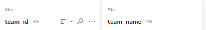
This is where I noticed that the number of TeamID's did not match up with the number of team names.
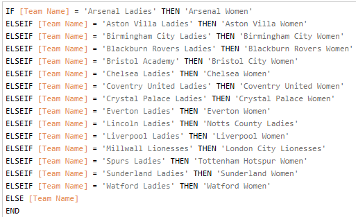
After doing some research, I concluded that this was due to teams changing over the years that this data was being collected. Many teams switched from ending in "Ladies" to ending in "Women". However this was not all teams so the solution here wasn't just to replace all instances of "Ladies" with "Women" as this would make unwanted changes to some of the names.
My solution to this was to check what team ID's had more than one team name associated with it. I then researched what the most recent team name was before creating an IF statement that made the replacements needed. The If statement also changed the names of teams that had a complete name change.
After making this replacement and looking through the data some more, I was ready to start planning and sketching.
Originally I had an idea for the path I wanted to take with this dashboard. However, after spending the entire morning and a portion of the afternoon on it, I ultimately abandoned this idea. The original idea was centered around attendance data but I felt there wasn't enough data to tell the story I wanted.
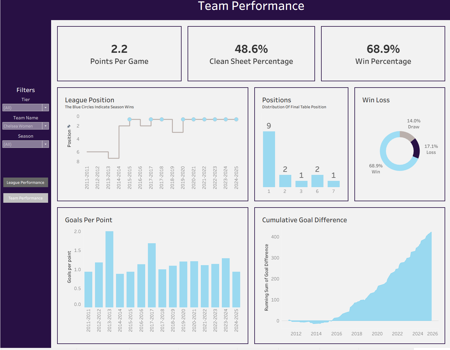
I ended up pivoting into dashboards centered around performance.
The First dashboard would look at the performance of each team, and the second would look at an individual team and how they performed over the years.
The sketch:
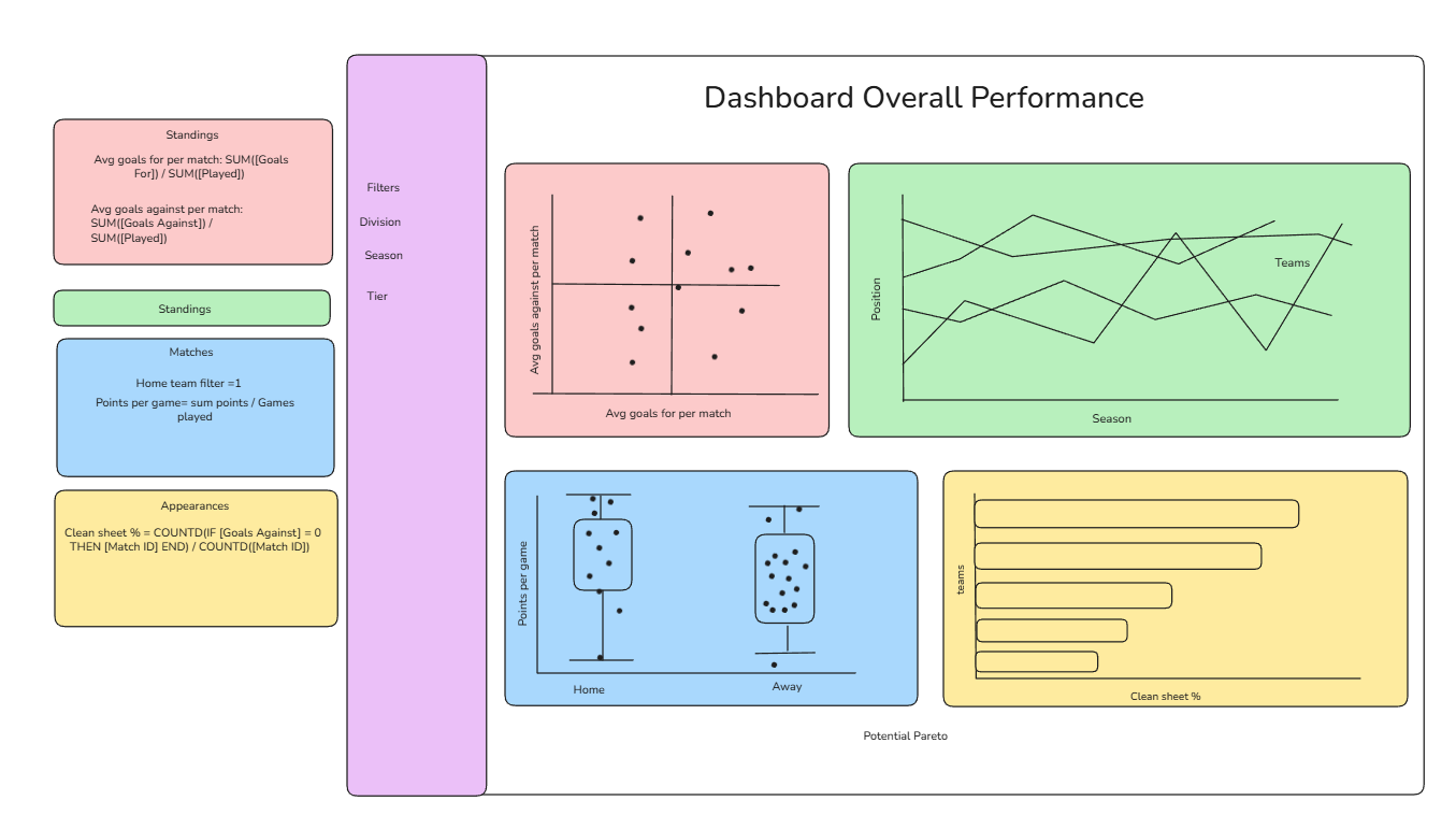
The sketch I made had the charts I wanted to make as well as the calculations and the dataset that I was going to use for it in boxes next to it. This really sped up the build process as I did not have to figure out how to make the charts.
I only ended up sketching one of the dashboards due to time becoming scarce. Had I taken the time to sketch the second dashboard, I fear I wouldn't have had time to create the second dashboard in Tableau.
In the end, I didn't end up sticking to the sketch completely, but it have me a good foundation for what I wanted to build.
I also wanted to focus on design and formatting in these dashboards, as that is something I have got feedback on in the past.
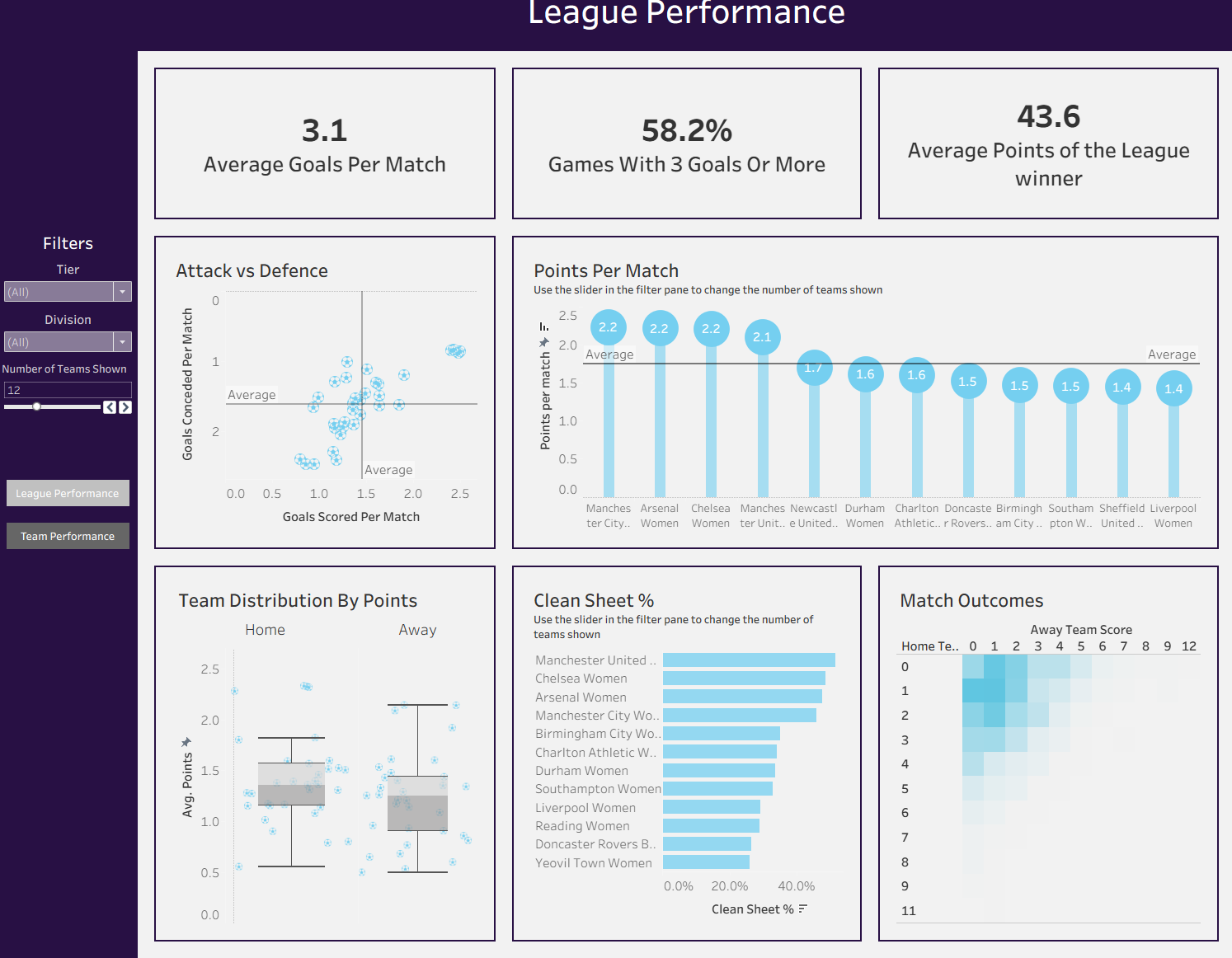
I spent much of Friday afternoon focused on picking the correct colors (I went with the Barclays blues as they are the title sponsor of both the Championship and the SuperLeague) and ensuring that the formatting was consistent across all charts and both dashboards.
This challenge was a real test of knowing when to start over. Even though I spent a lot of time on my first idea, switching from attendance to team performance made the data much easier to work with. I’m really happy with how the blue colors turned out and that I finally took the time to get the formatting right.