


London Bike Points Dashboard

The brief for the first day of dashboard week: https://www.thedataschool.co.uk/serena-purslow/dashboard-week-day-1-bike-point-apis/
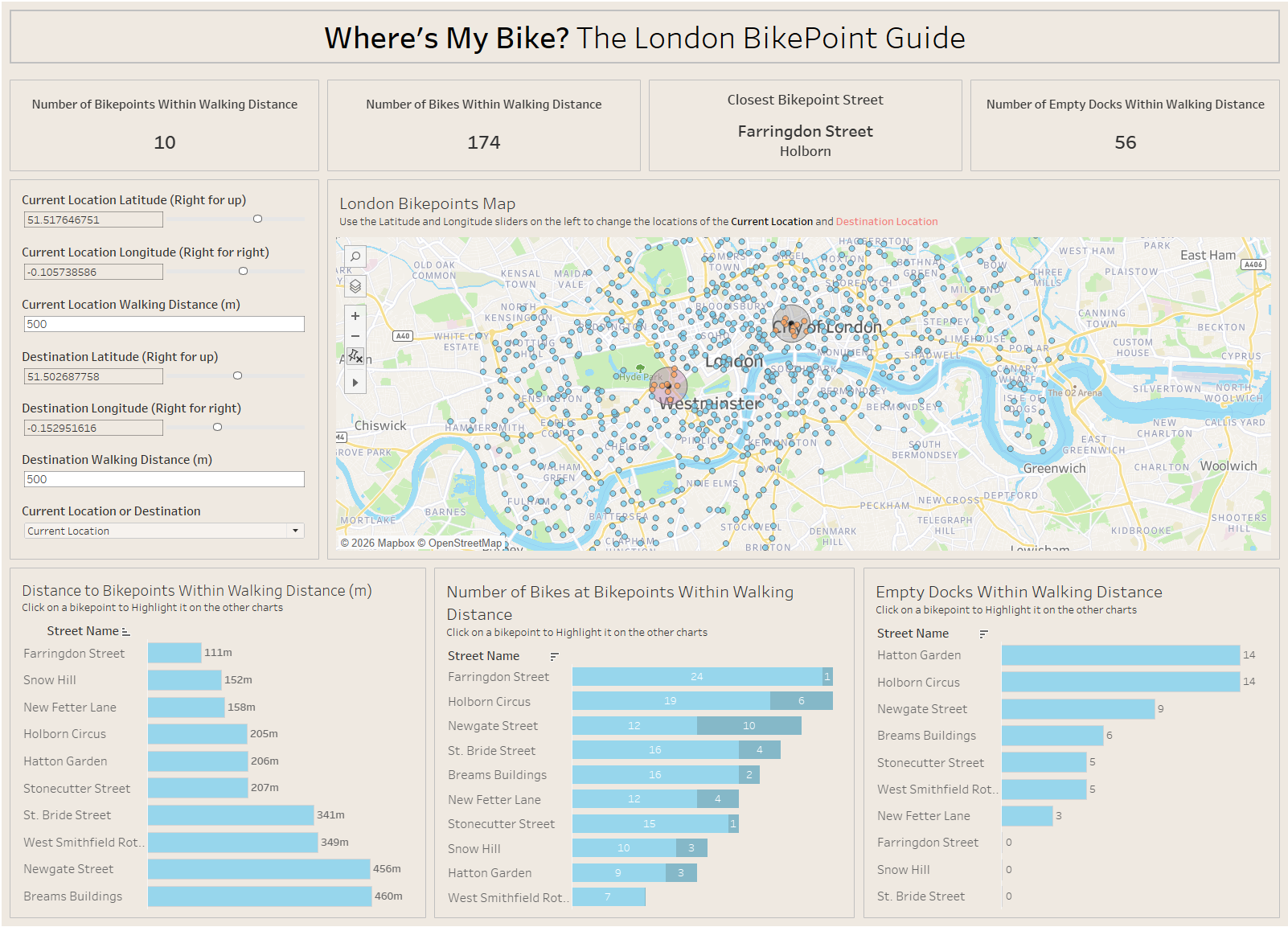
The basis behind the brief was to use Bike Point data from the TFL API to create a dashboard that would allow the user to see:
- Which Bike Points are near a user’s starting location?
- How many bikes are available at each nearby starting Bike Point?
- Which Bike Points are near a user’s destination?
- How many empty docks are available at each nearby destination Bike Point?
My plan of action for this dashboard was to first to plan out the day:
9:00-10:00 Call API and clean data
10:00-10:10 Break
10:10-11:00 User story and data exploration
11:00-11:10 Break
11:10-12:20 Chart Building
1:30-2:30 formatting
2:30-3:00 plan
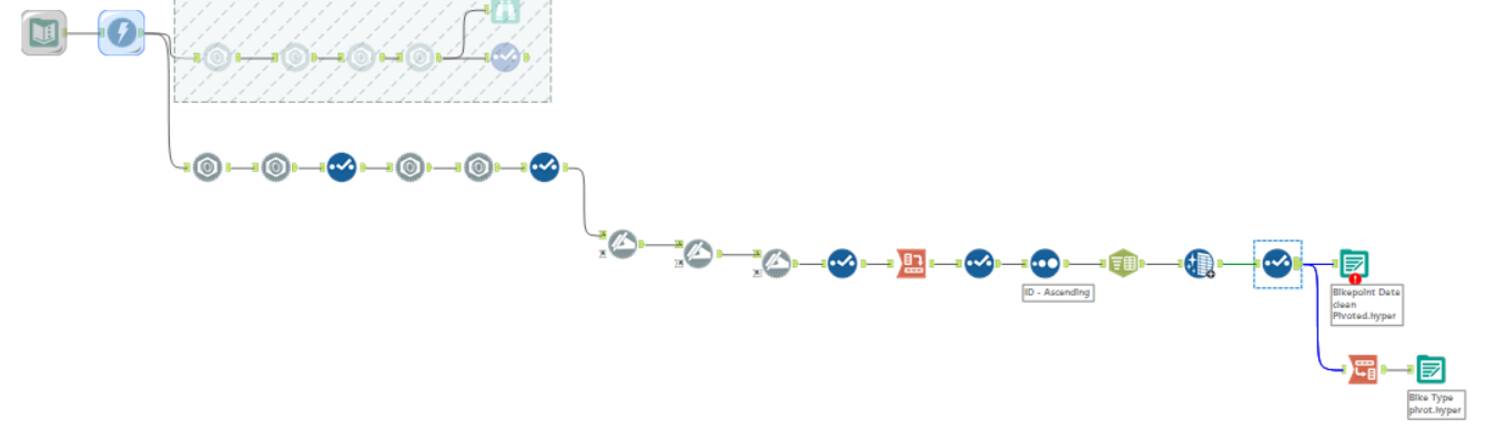
Calling the API and cleaning the data:
The API we used was the TFL London Bike Point API
 Artemis TFL
The first step I took was reading the documentation. After getting to know the API more, I started to bring it into Alteryx (My blog on API's: https://www.thedataschool.co.uk/adil-ahmad/example-of-a-simple-app-in-alteryx-2/ )
I used Alteryx to reveal all of the data available from the API
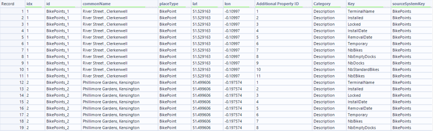
The problem here is that there are multiple lines for each bike point, each giving details about a specific metric.
I cross tabbed the data to give me all of the metrics and their values on one line.
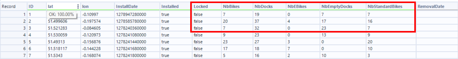
After a bit of cleaning, the data was ready to be exported.
My next step was to create a user story based on the brief:
As a bike user
I need to find out information about bike points at my location and destination
I can discover:
- How many bikes are available at each location
- How many bikes are available at each location
- Which bike points are near my destination
- How many empty docks are at the bike points near my destination
By analysing the data from the TFL bike points API
I then started sketching ideas for the dashboard.
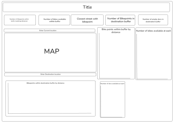
I didn't want to spend too much time on the sketch as it would eat in to the time I had to actually make the charts so I just ensured that my sketch had all of the charts on it that would fulfill the brief.
In the end I didn't stick to the sketch entirely but it was a good backbone for my dashboard.
The dashboard:
Functionality:
This dashboard allows the use to use the sliders for longitude and latitude to pin-point their location and destination location. Also selecting multiple points on the map changes the destination point to be in the middle of the selected points. So if the user knows they are going to a general area, they can set their destination point in that area. The user can then change the walking distance to increase or decrease the radius of the circle. This then filters the information in the charts and KPI's to only show the bike points within the radius.
The user can also click on a street in one of the bottom three charts and it will highlight that street across the other two. This allows you to click on the Bike point closest to you and see if it has any bikes in it or if there are any docking spaces left.